




The Shopify stores most worth learning from are the ones that test their changes and publish the numbers.
Our top picks are Stone Creek Coffee, Titan Casket, Tuckernuck and TUSHY, because each ran a simple change you can copy and reported a clear result, from about +$899K a month at Tuckernuck to +71.14% conversion at Titan Casket.
How we picked: every brand below has at least one A/B test (or a before/after result) in the LiftArchive database, and we checked each homepage's source code for Shopify files (cdn.shopify.com or Shopify.theme) in November 2026. We have not worked with these brands; results come from the brand, its agency or its testing tool, and we say which.
Design galleries show what a store looks like, not whether it sells.
Each example here shows one change, the number it moved and who measured it.
For other platforms, see our wider examples library.
All 22 Shopify store examples at a glance
| # | Example (brand or page) | What they did | Result | Type |
|---|---|---|---|---|
| 1 | Stone Creek Coffee | Dynamic "Save X% per oz" labels on sizes | +41% conversion rate | Ecommerce (coffee) |
| 2 | Titan Casket | Customer photos moved above the fold | +71.14% conversion | Ecommerce (caskets) |
| 3 | Tuckernuck | Size-based "Only X left!" message | About +$899K a month (est.) | Ecommerce (fashion) |
| 4 | TUSHY | Selling points above Add to Cart | +20% CR | Ecommerce (bidets) |
| 5 | Faherty | "60 Day Returns" under cart button | +10.5% conversion | Ecommerce (apparel) |
| 6 | The Oodie | "Number bought" on product pages | +12.5% conversion | Ecommerce (apparel) |
| 7 | Great Jones | Reworked collection quick navigation | +32.2% revenue/visitor | Ecommerce (cookware) |
| 8 | Feals | Subscribe and Save instead of Buy 2 | +38% subscription conversion | Ecommerce (supplements) |
| 9 | Showpo | Free-shipping strip on mobile product pages | +6.09% revenue | Ecommerce (fashion) |
| 10 | Hush Blankets | Desktop product page redesign | +51% revenue | Ecommerce (bedding) |
| 11 | Clare V. | Swapped cart recommendation tool | +11.7% conversion rate | Ecommerce (accessories) |
| 12 | Modibodi | 60-day trial above the fold, new visitors | +9.8% conversion | Ecommerce (apparel) |
| 13 | Vegepod | Images in the mobile menu | +42% revenue per visitor | Ecommerce (garden) |
| 14 | Goat Milk Stuff | Clearer subscription, no new discount | +19.7% revenue | Ecommerce (skincare) |
| 15 | Ursa Major | Sticky mobile Add to Cart | +5.1% revenue per visitor | Ecommerce (skincare) |
| 16 | Simple Modern | Landing page instead of collection page | 0.60% to 0.88% conversion | Ecommerce (drinkware) |
| 17 | Bonafide | Skipped the cart page | +5.6% checkout rate | Ecommerce (supplements) |
| 18 | Branch Furniture | Product review in checkout | +16.5% conversion rate | Ecommerce (furniture) |
| 19 | Laura Geller Beauty | Products on empty search results | +30.7% conversion | Ecommerce (beauty) |
| 20 | Loop Earplugs | Removed extra payment buttons | +5.6% add to cart | Ecommerce (earplugs) |
| 21 | Odd Muse | "No extra fees" message for US shoppers | +14% conversion | Ecommerce (fashion) |
| 22 | Oceansapart | Similar products on sold-out pages | +11.6% conversion, +21.7% RPU | Ecommerce (activewear) |
The 22 Shopify store examples
1. Stone Creek Coffee (coffee subscriptions)
What they did: Stone Creek sells coffee on its Shopify site.
On a product page, it added dynamic "Save X% per oz" labels to the 2 lb and 5 lb sizes.
The label changes with the size and with one-time vs subscription.
Why it works: Bigger bags already cost less per ounce, but shoppers had to do the math.
The label does it for them at the moment they pick a size.
Result: +41% conversion rate, with +26% revenue per visitor and +117% subscription orders per visitor.
Average order value fell 10%. Run by Blend Commerce as an A/B/C test on a single product page.
Copy this: If you sell sizes or packs, show the unit saving next to each option, not just the total price.
2. Titan Casket (caskets and urns)
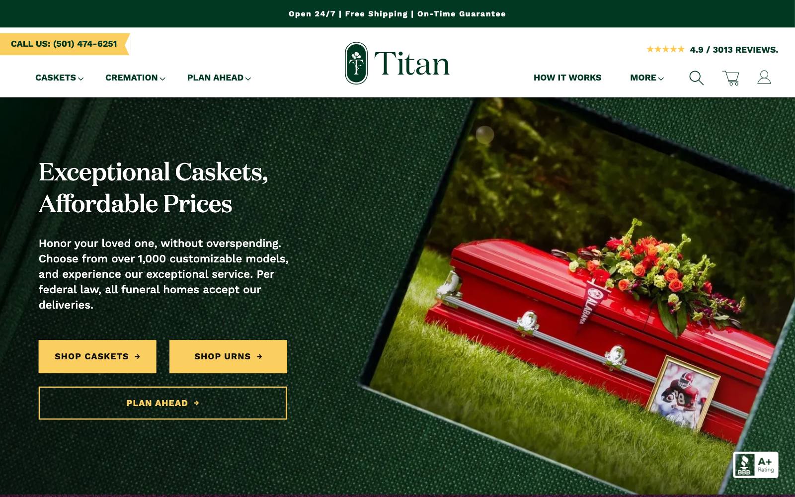
What they did: Titan Casket sells caskets online and ships to funeral homes.
On mobile product pages, the customer photo section sat far below the product images.
The test moved it up beside the main images, above the fold, and made the "See customer photos" link more visible on desktop.
Why it works: For a high-stakes purchase nobody can see in person, real photos from other families answer "what will it actually look like?" faster than any copy.
Result: +71.14% conversion and +24.40% revenue per visitor, at 95% confidence over two weeks.
Run by Blend Commerce. A lift this large is worth re-testing before you count on it.
Copy this: If you have customer photos, put them in the first screen of the product page, not at the bottom with the reviews.
3. Tuckernuck (women's fashion)
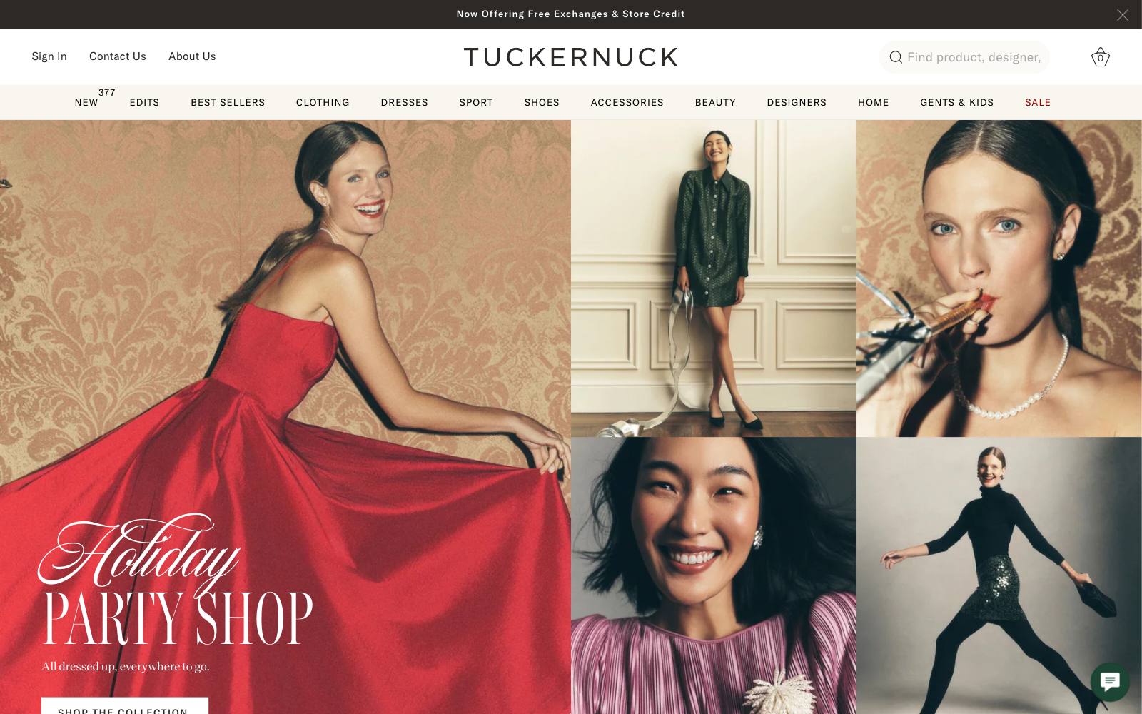
What they did: Tuckernuck, a women's clothing retailer that now runs at tnuck.com, added a dynamic "Only X left!" message based on the size the shopper selected.
Why it works: The stock count is real and tied to the shopper's own size, which is the only stock number they care about.
That makes it useful information rather than pressure.
Result: About +$899K a month in estimated revenue uplift.
The roadmap was led by Domaine and the tests were built in Visually; the monthly figure is an estimate, and sample size was not published.
Copy this: Show low stock only when it is true, and at the variant level (size, color), not for the product as a whole.
4. TUSHY (bidets)
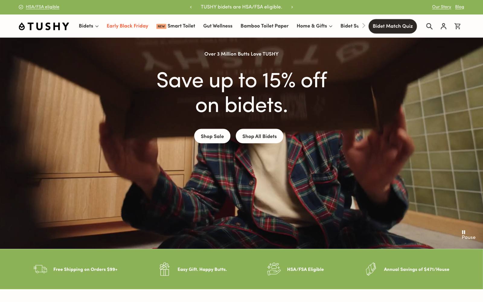
What they did: TUSHY sells bidet attachments. The control kept the Add to Cart button as high on the product page as possible.
The variant placed its selling points above the button, still above the fold.
Why it works: A bidet is an unfamiliar purchase for many people.
Pushing the button up does not help if the shopper is not yet convinced; a few clear reasons do.
Result: +20% CR (conversion rate). Published by Visually; sample size and significance not stated.
Copy this: Test three short benefit lines directly above your Add to Cart button instead of forcing the button to the top.
5. Faherty (apparel)
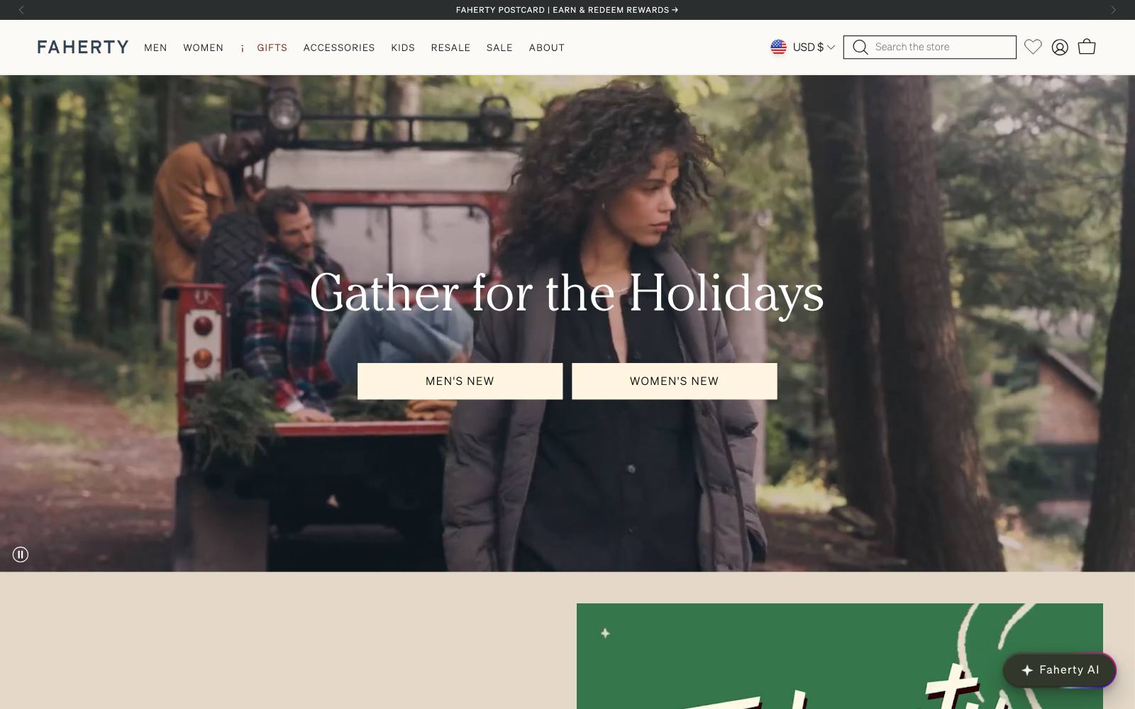
What they did: Faherty sells clothing for men and women.
It added a "60 Day Returns" line under the checkout button in the cart.
Why it works: Returns are the last worry before paying for clothes.
Answering it right where the shopper commits removes the reason to stall.
Result: +10.5% conversion and +13.2% revenue per session.
Published by Visually. The test ran only six days, so treat it as a strong hint, not proof.
Copy this: Put your returns window, in plain words, directly under the cart checkout button.
6. The Oodie (wearable blankets)
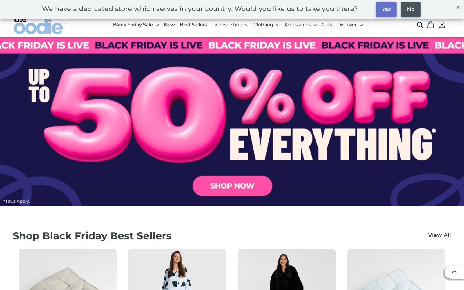
What they did: The Oodie sells oversized wearable blankets.
Its product pages already had reviews and customer content.
The test added a message showing how many shoppers had bought the product.
Why it works: A purchase count is a fast, one-line form of social proof.
Shoppers read it in a second, while reviews take effort.
Result: +12.5% conversion. Published by Visually; sample size and significance not stated.
Copy this: If your numbers are real and meaningful, show a short "X bought this" line near the price. See more in our social proof examples.
7. Great Jones (cookware)
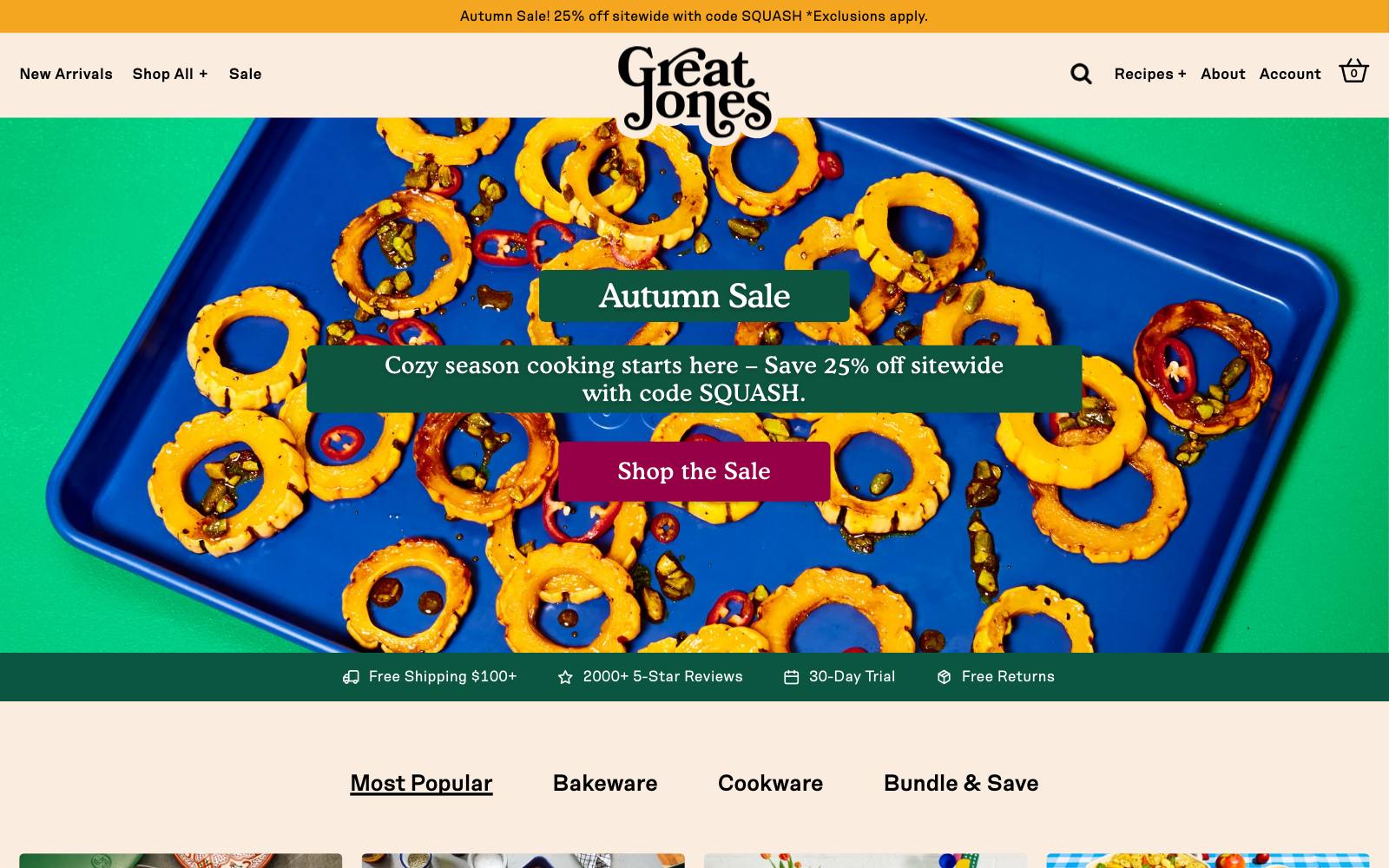
What they did: Great Jones sells cookware and bakeware.
It reworked the quick navigation on its collection pages after a site audit from its testing tool, Shoplift.
Why it works: Collection pages are where shoppers sort a range into "the one for me."
Better shortcuts there move them to a product page sooner.
Result: +32.2% revenue/visitor. Run by Great Jones on Shoplift. The exact changes were not described.
Copy this: Watch session recordings on your collection pages; if shoppers scroll up and down hunting, add quick links to the main sub-ranges.
8. Feals (CBD supplements)
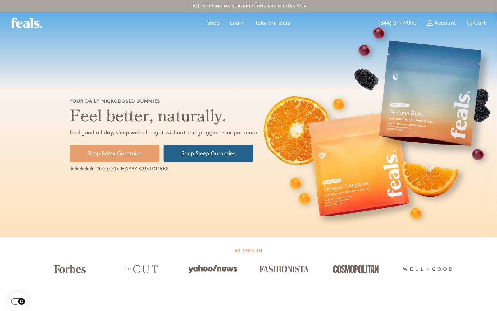
What they did: Feals sells microdosed CBD and THC supplements.
On a cold-traffic landing page, it swapped the "Buy 2 with a discount" option for "Subscribe and Save," keeping "Buy 1" as the other choice.
Why it works: For a product people use daily, a subscription matches how they will actually buy.
A bulk discount asks a new visitor to commit to more product up front.
Result: +38% subscription conversion and +10% one-time conversion over 21 days. Run by Feals.
Copy this: For consumables, test a subscription offer against your multi-buy offer on paid-traffic landing pages.
9. Showpo (women's fashion)
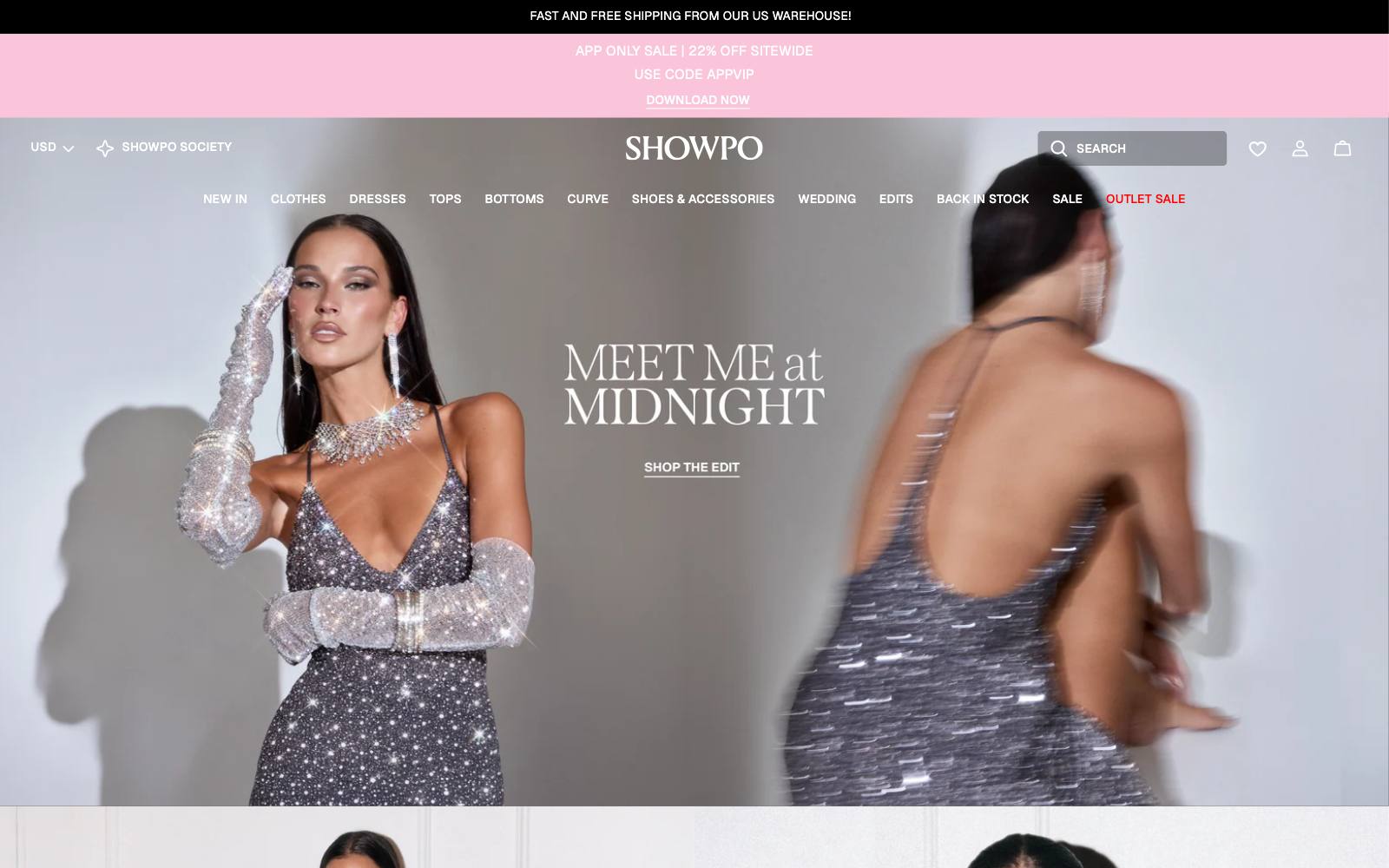
What they did: Showpo sells women's fashion. It added a free-shipping strip to mobile product pages.
A second variant added a pop-up too, but the pop-up hid the strip and did worse.
Why it works: Shipping cost is a top reason people leave.
A simple strip answers it without blocking the page.
Result: +6.09% revenue (about $22,080 extra over the 44-day test) on mobile.
Published by VWO. A similar strip on desktop gave +5.22% revenue.
Copy this: Show your free-shipping offer on the product page itself, and do not cover it with a pop-up.
10. Hush Blankets (weighted blankets)
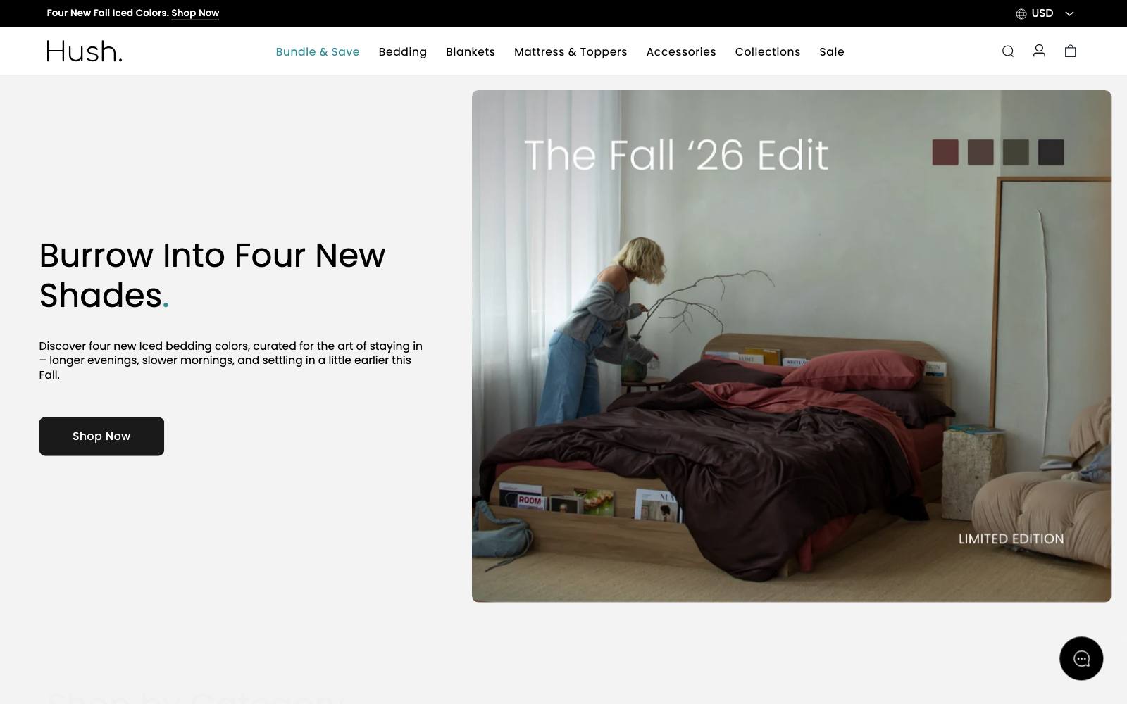
What they did: Hush sells weighted blankets and bedding.
On desktop product pages, it made the image column sticky, enlarged the installment-payment note, shrank the option boxes so the button sat in the first screen, and moved the description and reviews into accordions.
Why it works: The redesign kept the decision tools in view and tucked the detail into accordions.
Result: +51% revenue (+33.15% purchases) over 15 days on Canadian desktop traffic.
Published by VWO. Many changes were bundled, so you can't tell which one did the work.
Copy this: On desktop, check whether your Add to Cart button is visible without scrolling.
If not, collapse the description before you cut anything else.
11. Clare V. (handbags and accessories)
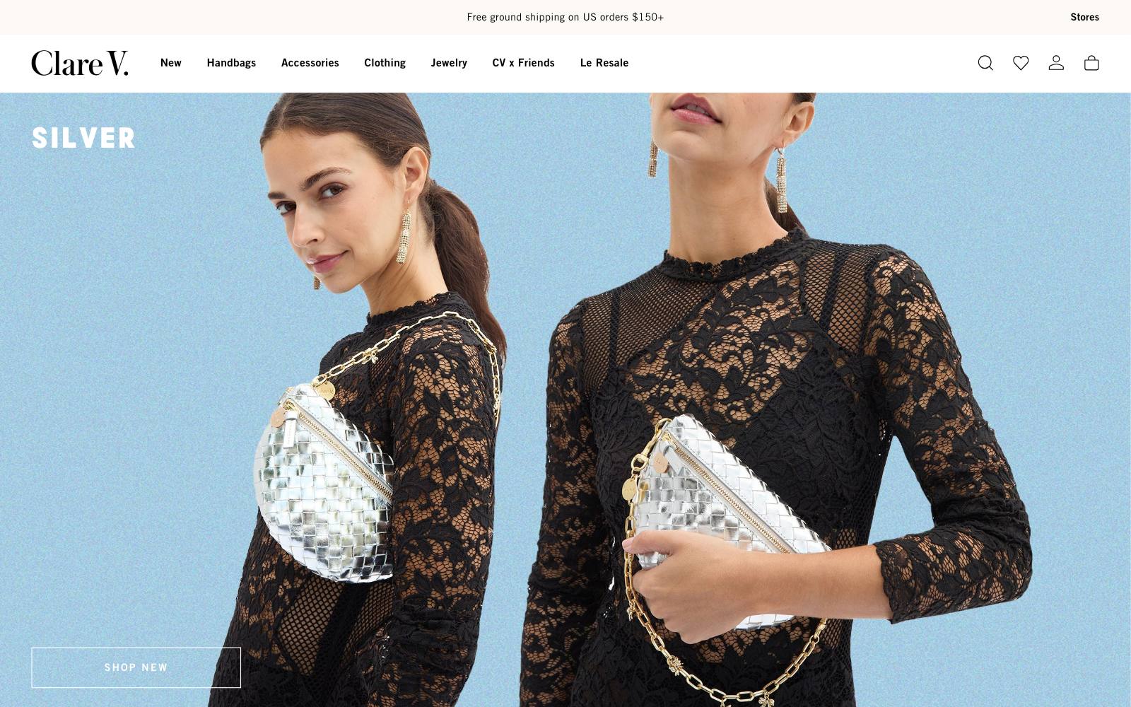
What they did: Clare V. sells handbags and accessories.
It replaced the cart recommendations from its existing upsell app with recommendations from a different tool, Visually.
Why it works: The cart is a cheap place to add value, but only if the suggestions fit what is already in the bag. Recommendation quality varies a lot between apps.
Result: +11.7% conversion rate. Published by Visually, the winning tool's maker, so read it as a vendor result.
Copy this: If you swap apps, run old against new as an A/B test instead of switching and hoping.
12. Modibodi (period underwear)
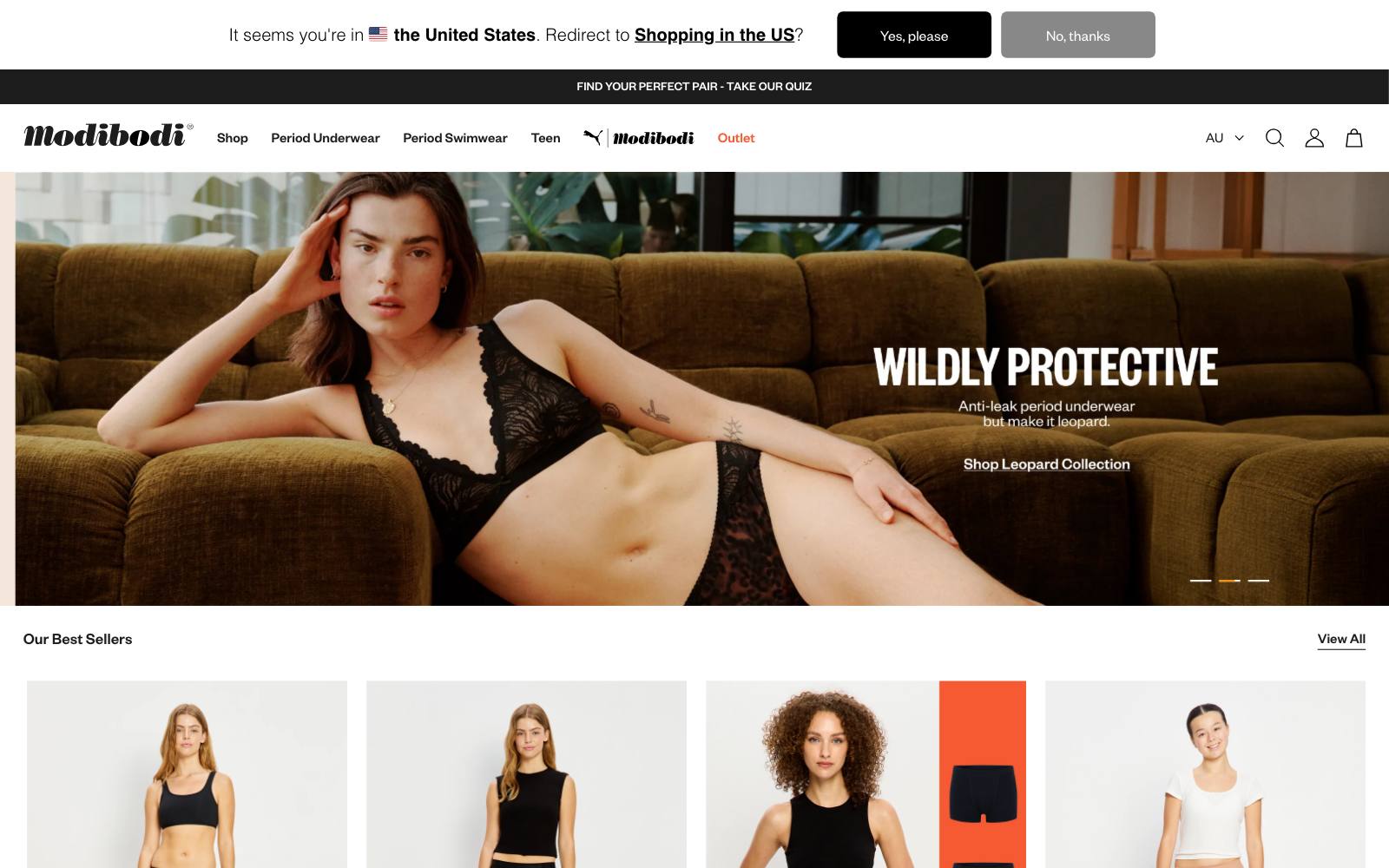
What they did: Modibodi sells leak-proof period underwear.
It showed a 60-day trial message above the fold on product pages, to new customers only.
The first version was not a big win; this was the second try.
Why it works: New buyers doubt whether the product works.
A trial removes the risk, and showing it only to new visitors keeps it out of returning buyers' way.
Result: +9.8% conversion. Run by TAG; sample size and significance not stated.
Copy this: If a guarantee test is flat, try it again with a different position or audience before you drop it.
13. Vegepod (raised garden beds)
What they did: Vegepod sells raised garden beds.
In the mobile menu, it added a small image next to each key category link instead of text alone.
Why it works: A picture makes each category clear before the tap.
Result: +42% revenue per visitor, +14% conversion rate and +24% average order value over 21 days.
Run by Blend Commerce; significance was not stated.
Copy this: If your category names are not self-explanatory, add thumbnails to the mobile menu.
14. Goat Milk Stuff (goat milk soap)
What they did: Goat Milk Stuff sells goat milk soap and skincare.
It made its subscription option clearer, added a frequency selector, put a satisfaction guarantee under the button and reviews near the selector, and let shoppers switch to subscription in the cart. It added no new discounts.
Why it works: Shoppers skip subscriptions they don't understand.
Explaining it beats paying them to sign up.
Result: +19.7% revenue in gross subscription revenue, tracked over one month.
Run by Blend Commerce. This was a before/after change, not a split test.
Copy this: Before you raise your subscribe-and-save discount, test a clearer explanation of how the subscription works.
15. Ursa Major (skincare)
What they did: Ursa Major sells natural skincare.
It added a sticky Add to Cart button to mobile product pages.
Why it works: On a phone the button scrolls away fast; keeping it on screen lets shoppers buy the moment they decide.
Result: +5.1% revenue per visitor on mobile, statistically significant. Run by UN/COMMON on Shoplift.
Copy this: Test a sticky mobile Add to Cart, but see AFTCO below: the version with dropdowns did not clearly win.
16. Simple Modern (drinkware)
What they did: Simple Modern sells tumblers and water bottles.
For its Spidey Kid design, it sent traffic to a custom landing page built in Replo instead of the standard Shopify collection page.
Why it works: A landing page can tell one product's story and keep the visitor on a single choice.
Result: Conversion went from 0.60% to 0.88% between July 5 and August 15, 2024. Run by Simple Modern.
Copy this: For a launch or a licensed design, test a dedicated landing page against your collection page. See Shopify landing page builders.
17. Bonafide (women's health supplements)
What they did: Bonafide sells women's health supplements.
Its cart drawer checkout button sent shoppers to a separate cart page with a "how did you hear about us" dropdown. The test removed that extra step.
Why it works: Every extra page before payment loses people.
Result: +5.6% checkout rate, and more shoppers filled in the attribution question. Published by Visually; sample size not stated.
Copy this: If you use a cart drawer, check that its checkout button goes straight to checkout.
18. Branch Furniture (office furniture)
What they did: Branch sells office chairs and desks.
It showed a product review for its Ergonomic Chair inside checkout.
Why it works: Office furniture is a considered buy.
One more reassuring voice at the payment step helps the shopper finish.
Result: +16.5% conversion rate. Published by Visually; sample size and significance not stated.
Copy this: If you can edit checkout, add one short review for the item being bought.
Our Shopify checkout customization guide covers what you can change.
19. Laura Geller Beauty (makeup)
What they did: Laura Geller sells makeup. Searches with no matches used to return an empty page. The test showed relevant products instead.
Why it works: Searchers are ready to buy; a blank page tells them you have nothing.
Result: +30.7% conversion, likely measured on visitors who hit an empty search. Published by Visually.
Copy this: Search your own site for common misspellings today.
If you get a blank page, fill it with best sellers.
20. Loop Earplugs (earplugs)
What they did: Loop sells reusable earplugs. It removed the "more payment options" area and the Buy with Shop button from its product page.
Why it works: Extra payment buttons under Add to Cart compete for attention.
Result: +5.6% add to cart. Published by Visually.
Stone Creek Coffee saw a similar effect: +13% conversion from removing express checkout on the product page.
Vegepod saw the opposite, with +35.8% conversion rate from adding it, so test this on your own site.
Copy this: Test your product page with and without express checkout buttons. The answer differs by site.
21. Odd Muse (UK women's fashion)
What they did: Odd Muse sells women's fashion from a UK site.
It showed US shoppers a clear message that there would be no extra fees at checkout.
Why it works: Cross-border shoppers fear surprise duties on delivery.
Saying "no extra fees" removes that fear before they pay.
Result: +14% conversion. Published by Visually; sample size and significance not stated.
Copy this: If you sell abroad and include duties, say so in checkout for those countries.
22. Oceansapart (activewear)
 DRIP Agency
What they did: Oceansapart sells activewear. When a variant sold out, the product page showed only a "Notify Me" button.
The test added a "Similar Products" section below it.
Why it works: A sold-out page is a dead end.
Similar items give the shopper somewhere to go next.
Result: +11.6% conversion, +21.7% RPU (revenue per user).
Run by DRIP Agency. The Oodie saw a similar win: +9.5% conversion rate from out-of-stock recommendations.
Copy this: Never leave a sold-out product page with only a waitlist button. Add three similar in-stock items.
Patterns across the winners
They answer the last question before the button
Returns, fees, trials and shipping showed up again and again: Faherty's returns line, Odd Muse's "no extra fees," Modibodi's trial and Showpo's free-shipping strip.
None of these changed the product. They removed a worry at the moment of decision.
They show proof where shoppers look
Titan Casket moved customer photos up, The Oodie added a purchase count and Branch put a review in checkout.
The proof already existed; the test was about where it sat. Our social proof guide goes deeper.
They remove dead ends and extra steps
Bonafide skipped a cart page, Laura Geller filled empty search results and Oceansapart added options to sold-out pages.
Find the places where a ready buyer gets stuck and give them a next step.
They do the math for the shopper
Stone Creek's per-ounce savings and Feals' subscription offer both made the better-value choice obvious without a bigger discount.
Goat Milk Stuff grew subscription revenue without adding any discount at all.
Mobile and desktop often disagree
Several brands shipped a change on one device only. Split results by device before rolling out.
Examples that lost (what not to copy)
- Vegepod, accordions on product pages: grouping product information into accordions gave -8% revenue per visitor overall. It won on desktop (+26% RPV) but lost badly on mobile (-24% conversion rate), so Vegepod rolled it out on desktop only. Run by Blend Commerce.
- Loop Earplugs, personalized case at checkout: offering an engraved case for an extra €6 in checkout lost: -3.04% conversion rate and -2.96% revenue per visitor, at 99% confidence. Run by Dash of CX on Convert. An extra decision in checkout can cost more than the add-on earns.
- AFTCO, sticky add-to-cart bar with dropdowns: a sticky mobile bar with size and color dropdowns lifted add-to-cart by +7.6% ATC, inconclusive, but revenue fell on lower order value. Run by Clean Commit. A simpler sticky button at AFTCO gave +3.9% add-to-cart.
- Stone Creek Coffee, two-image product cards: +20% mobile CR, -12% on desktop. It shipped on mobile only.
- Titan Casket, subcategory widgets: links to subcategories above the collection grid gave +31.77% RPV, conversion -24%. Fewer people bought, but they spent more. Decide which metric you care about before you call a winner.
How to test this on your own site
- Pick one idea that fits a problem you can see. Use analytics, session recordings or customer questions to find the worry or dead end first, then choose the matching example above.
- Use a Shopify-native testing app. Several brands here ran tests in Intelligems, Shoplift, VWO, Convert or Visually. Our Shopify A/B testing apps list compares them, and our Shopify A/B testing guide covers setup.
- Choose the metric before you start. Revenue per visitor catches cases like Titan Casket's, where conversion fell but revenue rose.
- Run it long enough. Cover at least one or two full weeks so weekday and weekend shoppers both count, and check results by device.
- Know your baseline. Compare your numbers with our Shopify conversion rate benchmarks.
If you would rather have someone plan and run the tests, our Shopify CRO agencies list includes several of the teams credited above.
Real results from Shopify stores
 Blend CommerceBlend Commerce
 Visually
Watch out for
- Fake urgency: Tuckernuck's low-stock message works because the count is real and tied to the selected size. Made-up timers and stock counts erode trust once shoppers notice. See our urgency examples.
- App stacking: many of these wins came from a new widget or app. Each app adds scripts, and a slower page can cancel out the gain. Remove apps you replace.
- Vendor-published results: many results here come from the testing tool's own case studies, often without sample sizes. Use them as ideas to test, not as forecasts.
- Discount dependence: Goat Milk Stuff and Stone Creek grew subscriptions by explaining value, not by cutting price. Try clarity before discounts.
For a full playbook, read our Shopify CRO guide.