


The best homepage designs answer three questions on the first screen: what this is, why it is better, and what to click next.
In our archive, the biggest tested wins came from heroes that restate the offer with proof, like Oliver Kenyon's rating-and-benefits hero (+$78,454 per month), and from showing real products or the product itself early, like Rows letting visitors use its spreadsheet before signing up (+72% sign-ups).
How we picked: 16 of these 22 examples are A/B tests or before-and-after results from the LiftArchive database, across ecommerce, SaaS and lead gen.
The other six are live homepages we loaded in November 2026 and describe as they appeared.
We have not run these tests ourselves; each result is credited to whoever did.
A good example shows what changed and what it did to sales, sign-ups or leads.
For the full method, see our guide to homepage optimization. For more page types, browse all examples.
All 22 examples at a glance
| # | Example (brand or page) | What they did | Result | Type |
|---|---|---|---|---|
| 1 | 7-figure ecommerce brand (Oliver Kenyon) | Rating, benefits and press logos in the hero | +$78,454/month | Ecommerce |
| 2 | Leather goods brand (Oliver Kenyon) | Category bubbles above mobile hero | +10.9% revenue per visitor | Ecommerce |
| 3 | Ecommerce brand (Dave Diederen) | Hero rebuilt as a mini landing page | +72.15% revenue per visitor | Ecommerce |
| 4 | Ecommerce brand (Dave Diederen) | Static image replaced hero video | +52.67% revenue per visitor | Ecommerce |
| 5 | High-ticket brand (Dave Diederen) | Best-sellers row under the hero | +29.72% revenue per visitor | Ecommerce |
| 6 | Dr. Axe | Smaller hero, top sellers above the fold | +26% conversion | Ecommerce |
| 7 | Jackson's | USPs moved above homepage copy | +225% conversion rate | Ecommerce |
| 8 | Luxury pajama brand | Press logos below the hero | +$109,829/month | Ecommerce |
| 9 | Pvolve | Cart reminder for returning shoppers | +14.7% conversion | Ecommerce |
| 10 | Allbirds | Shop Men / Shop Women hero buttons | Live example, not tested | Ecommerce |
| 11 | Glossier | Short headline, offers in the bar | Live example, not tested | Ecommerce |
| 12 | Hubstaff | Redesign with hero email form | +49% visitor-to-trial | SaaS |
| 13 | Rows | Product as the homepage | +72% sign-up conversion | SaaS |
| 14 | GetResponse | Free Trial button next to Buy Now | +158.6% free accounts | SaaS |
| 15 | Orah | Industry terms, testimonials up top | +63% demo clicks | SaaS |
| 16 | Notion | Two CTAs plus a logo wall | Live example, not tested | SaaS |
| 17 | Calendly | Sign-up buttons in the hero | Live example, not tested | SaaS |
| 18 | Loft Resumes | Clear value proposition | +64.8% purchases | Lead gen |
| 19 | CORGI HomePlan | USP bar under the header | +30.9% conversions | Lead gen |
| 20 | Humana | Simpler banner, clearer CTA | +433% clickthrough | Lead gen |
| 21 | Lemonade | Products with starting prices | Live example, not tested | Lead gen |
| 22 | Headspace | "Try for $0" hero button | Live example, not tested | App |
The 22 homepage design examples
1. A hero that leads with a rating, benefits and press logos (ecommerce)
What they did: The new hero put "Rated 4.9/5 by Thousands" above a clearer headline, added three checkmark benefits and a new image, then three benefit tiles and a "Featured In" logo row under a Shop Now button.
Why it works: A first-time visitor gets the three answers they need in one screen: what this is, why it is better, and who else trusts it.
Result: +$1.54 revenue per session and +$78,454 per month in revenue, run by Oliver Kenyon.
No sample size was shared. See the test.
Copy this: Put your rating line above the headline and three short benefit checkmarks under it, then test it against your current hero.
2. Story-style category bubbles above the mobile hero (ecommerce)
What they did: A 7-figure leather goods brand added a scrollable row of round category thumbnails (Wallets, Phone Cases, Crossbody, Laptop Cases, Backpacks, Totes) between the header and the hero on mobile.
Why it works: Shoppers who already know what they want can jump straight to it, and the row shows the full range before anyone scrolls.
Result: +10.9% revenue per visitor (about $25,440 a month), +7.7% average order value and +2.9% conversion rate, run by Oliver Kenyon. See the test.
Copy this: On mobile, add a swipeable row of 5-7 category images above the hero, ordered by your top-selling categories.
3. A hero rebuilt like a mini landing page (ecommerce)
What they did: Dave Diederen redesigned the homepage hero to restate the offer, show why the brand is credible and send people to the product page.
Why it works: Many homepage visitors arrive from ads or brand searches and need the pitch again.
A hero that sells, rather than just looks good, gives them a reason to click through.
Result: +72.15% revenue per visitor ($1.09 to $1.87) and conversion rate up from 3.63% to 5.08%, run by Dave Diederen.
Design A did worse than control. The range was very wide. See the test.
Copy this: Write your hero as if it were the only thing a visitor reads: offer, proof, one button.
4. A static benefit image instead of an autoplay video (ecommerce)
What they did: The homepage hero was an autoplaying video.
Three static image heroes were tested against it: product focus, lifestyle callout and a benefit-led shot.
Why it works: A static image with a clear message loads faster and can be read in a second. Video makes visitors wait for the point.
Result: +52.67% revenue per visitor for the best image ($1.46 to $2.23), run by Dave Diederen.
All three images beat the video, but the eight-day test had wide ranges. See the test.
Copy this: If your hero is a video, test it against a still image with one benefit line on top.
5. A best-sellers row right under the hero (ecommerce)
What they did: The homepage opened with a hero and category links, so visitors had to click to see any product.
A row of best-selling products was placed directly under the hero, above the categories.
Why it works: Best sellers are social proof and a shortcut in one.
New visitors see what most people buy without having to choose a category first.
Result: +29.72% revenue per visitor (£10.00 to £12.98) and +30.88% conversion rate (1.14% to 1.49%), with no change in order value, run by Dave Diederen on a high-ticket store. See the test.
Copy this: Show 4-8 real products in the first or second screen of your homepage, pulled from your best-seller list.
6. Dr. Axe: a smaller hero so top sellers fit above the fold (ecommerce)
 Conversion Fanatics
What they did: Dr. Axe removed two secondary CTA sections so top sellers moved above the fold with a "customer favorites sell out fast" line, and kept one hero CTA for its new botanical blends.
Why it works: Fewer competing calls to action, and products visible on the first screen.
Result: Conversion rate went from 7.84% to 9.9% (+26%) and revenue per visitor from $6.78 to $9.30 (+37%), run by Conversion Fanatics. See the test.
Copy this: Shrink your hero until at least one row of products shows on a laptop screen without scrolling.
7. Jackson's: USPs moved above the homepage copy (ecommerce)
 Blend Commerce
What they did: Jackson's homepage had a title and description, then a USP block that only 30% of visitors scrolled to.
The test moved the USP block above the title and description.
Why it works: The reasons to buy were already on the page.
Moving them up meant most visitors actually saw them.
Result: +225% conversion rate and +66% average purchase revenue per user, run by Blend Commerce.
A lift this large suggests a small sample. See the test.
Copy this: Check your scroll map. If fewer than half of visitors reach your USPs, move them into the first screen.
8. Press logos right below the hero (ecommerce)
 Convertibles
What they did: A luxury pajama brand had no credibility elements above the fold on mobile.
The winning version put press logos (Vogue, People, Oprah Daily) with a rotating press quote directly below the hero.
Why it works: For a premium price, visitors want to know the brand is real before they look at products. Well-known names answer that fast.
Result: +$109,829 per month in revenue, run by Convertibles on Intelligems. See the test.
Copy this: If you have real press coverage, test a logo row directly under the hero, not in the footer.
9. Pvolve: the returning shopper's cart on the homepage (ecommerce)
 Visually
What they did: Returning shoppers saw their cart items front and center on Pvolve's homepage, with a path to checkout.
Why it works: A returning visitor has already done the hard part.
Showing the cart saves them from finding the products again.
Result: +14.7% conversion, reported by Visually. Vendor-reported; no sample size stated. See the test.
Copy this: Show returning visitors with items in their cart a "pick up where you left off" block at the top of the homepage.
10. Allbirds: split the first click by audience (ecommerce)
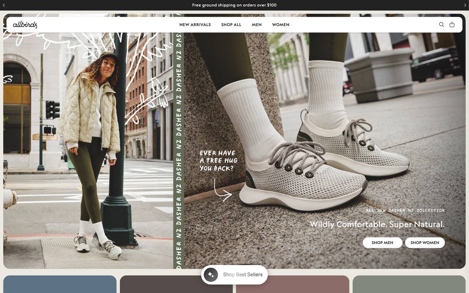
What they did: The hero names the new collection ("All New Dasher NZ Collection"), adds a two-part promise ("Wildly Comfortable.
Super Natural.") and gives two buttons: "SHOP MEN" and "SHOP WOMEN".
Why it works: For shoes, the first decision is men or women.
Two plain buttons let visitors make it in one click.
Result: Live example, not tested. Seen on allbirds.com in November 2026.
Copy this: If your range splits cleanly by audience, use one button per audience in the hero instead of a generic "Shop now".
11. Glossier: short headline, offers in the bar, products below (ecommerce)
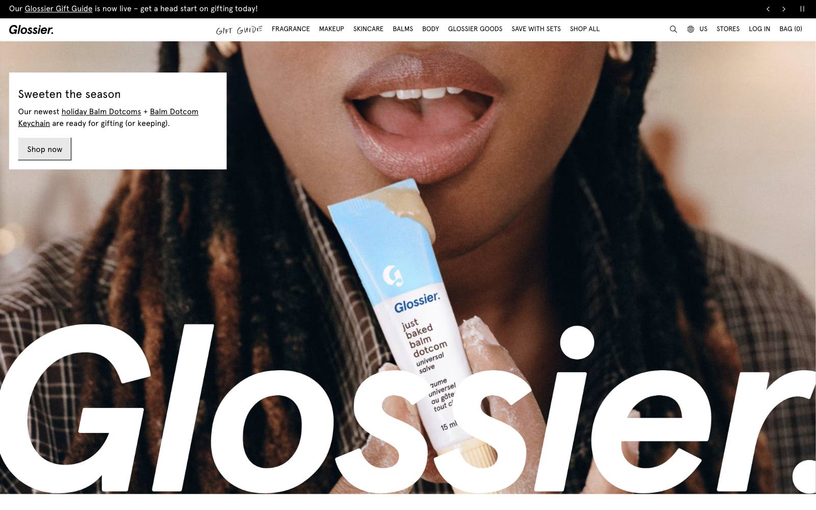
What they did: The hero headline is three words: "You look good."
Offers and the "Free standard shipping on orders $40+" message live in announcement bars, and the first section below the hero is a seasonal product row with a "Shop now" button.
Why it works: The brand voice does the work in the hero while the bar handles the practical questions (shipping, gifts) on every page.
Result: Live example, not tested. Seen on glossier.com in November 2026.
Copy this: Move shipping thresholds and offers into a slim announcement bar so the hero can stay focused on one message.
12. Hubstaff: newest features up front with a hero email form (SaaS)
What they did: Hubstaff replaced a long-running homepage with a full redesign that put its expanded positioning and newest features first, with an email form in the hero.
Why it works: The page now matched the current product, and the form removed a click.
Result: +49% visitor-to-trial conversion and +34% hero form submissions in a 3-month split URL test with 259k visitors, run by Hubstaff on VWO.
Trial-to-paid fell 7%, which the team put down to factors outside the homepage. See the test.
Copy this: If your homepage is more than two years old, check whether it still describes what you sell today, and track trial-to-paid as well as sign-ups.
13. Rows: the product is the homepage (SaaS)
What they did: Rows replaced a conventional marketing homepage with the product itself: visitors use a working sandbox spreadsheet without logging in and sign up later.
Why it works: For a tool people understand by using it, a live product beats any description of it.
Result: +72% sign-up conversion, and sandbox sign-ups activate 30% more often than other sign-ups.
This is a before-and-after result from Rows, covered by Growth.Design in its Adobe free-trial case study. See the test.
Copy this: If your product can run without an account, let visitors try a sample of it from the homepage before asking for an email.
14. GetResponse: a 'Free Trial' button next to 'Buy Now' (SaaS)
What they did: The homepage had one prominent "Buy Now" button, and the free trial was only offered on some inner pages.
The test added a "Free Trial" button next to it.
Why it works: Most first-time visitors are not ready to pay.
A low-risk second option catches them instead of losing them.
Result: +158.6% free accounts with no drop in paid accounts, run by GetResponse on VWO. See the test.
Copy this: If you offer a trial or free plan, put it in the hero next to your paid CTA, not only on the pricing page.
15. Orah: industry words, fewer menu items, testimonials up top (SaaS)
What they did: Orah cut its nav menu, swapped brand-specific product terms for common industry terms, and moved testimonials near the top of the homepage.
Why it works: Visitors search for and think in category words.
Using their language makes the product easier to place.
Result: +63% demo request clicks in 11 days, run by Orah on VWO.
Three changes were bundled and the metric is clicks, not booked demos. See the test.
Copy this: Replace any invented product names in your hero with the words customers use in sales calls and reviews.
16. Notion: one line, two paths, a wall of logos (SaaS)
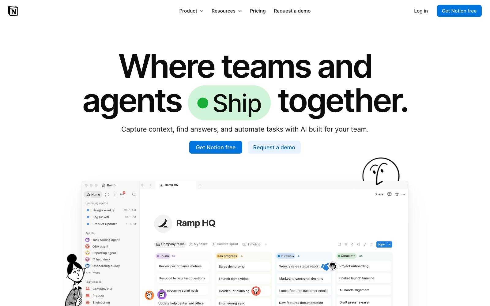
What they did: The headline reads "Where teams and agents Think together."
Two buttons sit under it: "Get Notion free" and "Request a demo".
Below, a section titled "The most ambitious companies run on Notion" shows rows of customer logos.
Why it works: The two buttons split self-serve users from buyers who want a sales call, and the logos answer "is this for serious teams?" right away.
Result: Live example, not tested. Seen on notion.com in November 2026.
Copy this: Give self-serve and sales-led visitors their own button in the hero.
17. Calendly: sign-up buttons in the hero (SaaS)
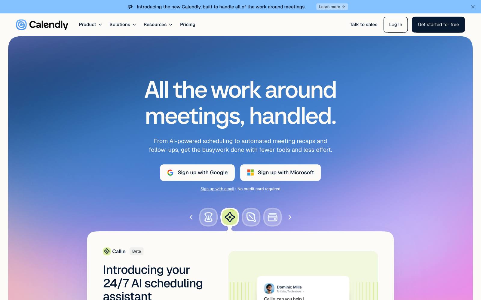
What they did: Under the headline "All the work around meetings, handled."
Calendly shows three sign-up buttons (Google, Microsoft, email) and the line "No credit card required."
Why it works: Single sign-on removes the form entirely, and the no-card line removes the main reason to hesitate.
Result: Live example, not tested. Seen on calendly.com in November 2026.
Copy this: If most of your users sign in with Google or Microsoft, put those buttons in the hero instead of a "Get started" link.
18. Loft Resumes: a clear value proposition and customer language (lead gen)
What they did: The old homepage had no headline.
The redesign added a value-proposition headline, grouped resumes the way buyers think about them (with or without photo) and added photo testimonials.
Why it works: Visitors could finally tell in a few seconds what was on offer and why it mattered to them.
Result: +64.8% purchases in a split URL test, run by Conversionlove on VWO.
Many changes shipped at once. See the test.
Copy this: Write a headline that names the outcome the visitor wants, using phrases from customer interviews.
19. CORGI HomePlan: a USP bar under the header (lead gen)
What they did: A boiler and home cover insurer added a bar of selling points (such as no hidden fees and fast service) under the header so every visitor saw them.
Why it works: In insurance, fear of hidden costs stops people.
Stating the answer on the first screen removes that worry early.
Result: +30.9% conversions (policy sign-ups), run by Worship Digital on VWO.
Sample size was not given. See the test.
Copy this: List your top three objections and answer each in a few words in a bar under the header.
20. Humana: a simpler banner with one clear CTA (lead gen)
What they did: Humana replaced a rotating banner with a winter image, dense copy and a weak call to action with a new summer image, a headline for the upper funnel, shorter copy and a more prominent CTA.
Why it works: One message and one obvious next step beat a busy banner that tried to say too much.
Result: +433% clickthrough into the marketing funnel, run by Humana.
Image, headline, copy and CTA changed together. See the test.
Copy this: Cut your hero copy to one headline and one supporting line, and make the button the most visible thing on screen.
21. Lemonade: pick your product, see a price (lead gen)
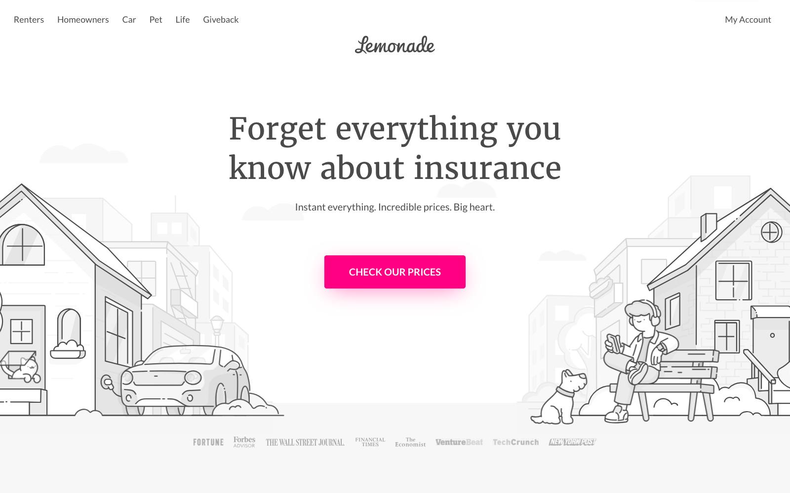
What they did: The headline "Forget everything you know about insurance" sits above a "Check our Prices" button.
The page lists five products, four of them with starting prices, such as "Renters: From $5/mo".
Why it works: Starting prices answer the first question every insurance shopper has, and the product list routes each visitor to the right quote flow.
Result: Live example, not tested. Seen on lemonade.com in November 2026.
Copy this: If you can show a "from" price, put it next to each service on your homepage instead of hiding it behind a form.
22. Headspace: a two-word promise and a $0 trial (app)
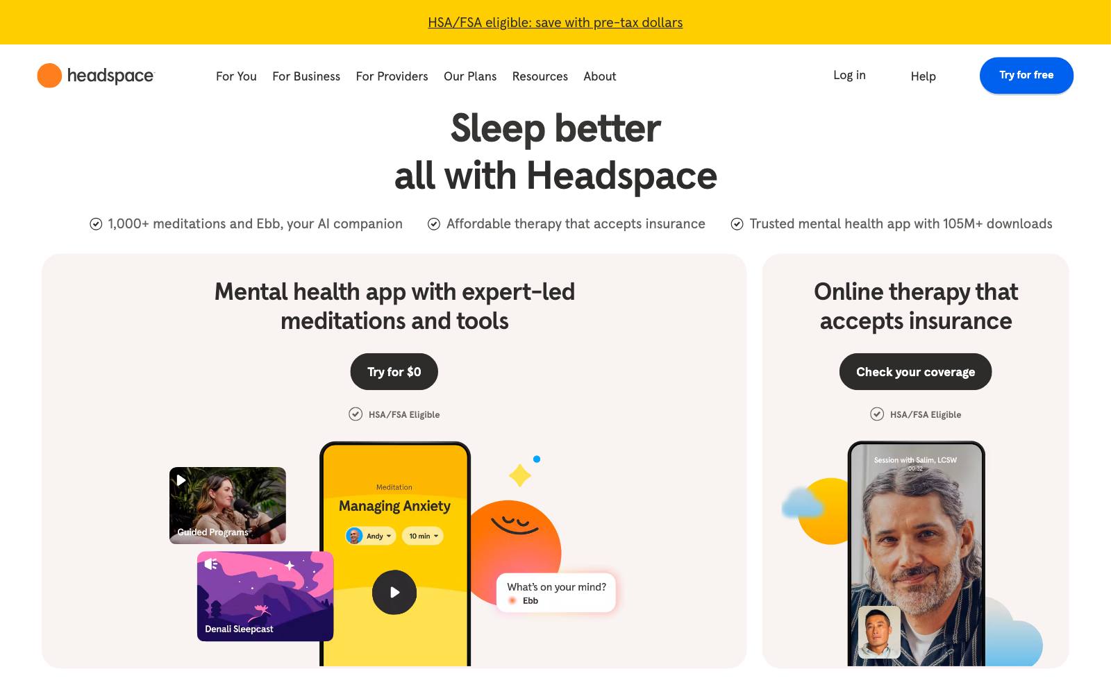
What they did: The hero says "Stress less" with the supporting line "Mental health app with expert-led meditations and tools", a "Try for $0" button and an "HSA/FSA Eligible" label.
Why it works: The button names the price of starting (nothing), and the HSA/FSA label answers a cost question for US visitors before they ask it.
Result: Live example, not tested. Seen on headspace.com in November 2026.
Copy this: For an app, put the trial terms in the button text itself, such as "Try free for 7 days".
Patterns across the winners
Ecommerce: show products and proof early
Best-sellers rows (#5, #6), category shortcuts (#2) and press logos (#8) all put something concrete on the first screen.
See more hero section tests and trust logo tests.
SaaS: shorten the path to trying it
A trial button next to the paid one (#14), a form in the hero (#12) and the product as the homepage (#13) all cut steps. Our SaaS homepage examples page goes deeper.
Lead gen: answer the worry, then ask
Insurance and services visitors worry about cost and hidden terms.
A USP bar (#19) or starting prices (#21) answer that before the form. More in lead-gen homepages.
Every type: say it in the visitor's words
Loft Resumes (#18) and Orah (#15) both won by swapping their own phrasing for the words customers use.
Our value proposition tests show the same thing on other pages.
Every type: move what works higher
Jackson's (#7) just moved its USPs up. Check what sits above the fold before you design anything new.
Examples that lost (what not to copy)
A sales carousel instead of a trust hero: replacing a trust-focused hero with a carousel of current sales and top products cut conversion rate by 46.2% and revenue per visitor by 87.6%, run by Clean Commit.
The sample was small (1,082 visitors in 26 days). See the test.
A science summary section: adding a block of research findings and medical institute names under "How does it work" lost 12.4% conversion rate, also run by Clean Commit. Not significant. See the test.
A longer trial sign-up: RegOnline moved from a two-step to a three-step free trial sign-up on its homepage and lost 24.5% of completed leads, reported by MarketingExperiments. See the test.
Hiding the product screenshot: Patrick McKenzie moved the Bingo Card Creator screenshot below the fold for three days and downloads fell about 25%.
It was a before-and-after check from 2006, not a randomized test. See the test.
Real results from our archive
 @oliverkenyon
 @DaveDiederen
 Clean Commit
How to test this on your own site
- Start with what visitors miss. Use a scroll map to find selling points that most people never reach, then move them up.
- Test one big idea at a time. A new hero is fine as one test, but know that you will not learn which part caused the change.
- Measure revenue or qualified sign-ups, not clicks. Hubstaff saw trials rise while trial-to-paid fell 7%, so track the step after the click.
- Run for full weeks. Short tests, like the eight-day video test in #4, give wide ranges. Aim for at least two full weeks.
Watch out for
Heavy heroes and page speed. Autoplay video, big carousels and stacked apps slow the first screen, and #4 suggests a still image can sell better anyway.
Fake proof. Only show ratings and press logos you can back up.
Discount-led heroes. The sales carousel that lost 46.2% shows that leading with deals can backfire.