




The best ecommerce websites aren't the prettiest. They answer shoppers' questions faster and remove steps.
The 20 examples below are real sites, each with one design choice that was A/B tested and won, from Dr. Squatch's default quantity of two (up to +54% revenue per user) to Kiehl's free-gift gauge (+31% revenue) and Muc-Off's products-first category page (+106% sales).
How we picked: every example is a public site with a test result in our archive, taken from the brand's or agency's published case study.
We list who ran each test. We did not run these tests or audit the sites ourselves.
Sites run on Shopify, custom builds and enterprise platforms, and the patterns apply to any site that sells online.
For more by page type, see our homepage examples, product page examples and checkout page examples, or browse all examples.
What makes a good ecommerce website example
A good example has one change you can point to and a measured result.
A beautiful homepage tells you little if nobody knows whether it sells more than the last one.
So each entry below names one pattern per site, the number it moved, and who ran the test.
Some results are combined programs or before-and-after comparisons, and we say so where that's the case.
All 20 examples at a glance
| # | Example (brand or page) | What they did | Result | Type |
|---|---|---|---|---|
| 1 | G FUEL | Quick add-to-cart on collection pages, stronger product page tops, trust content at checkout | +$286,348/month | Ecommerce (site-wide) |
| 2 | Dr. Squatch | Quantity selector preset to 2 bars of soap | up to +54% revenue per user | Ecommerce (product page) |
| 3 | GANNI | Merged the email step into the main checkout form | +10% at GANNI | Ecommerce (checkout) |
| 4 | Liquid Death | Countdown timer during a real flash sale | +9% conversion rate | Ecommerce (site-wide) |
| 5 | Great Jones | Simpler mobile homepage for first-time visitors | +26.2% revenue/visitor | Ecommerce (homepage) |
| 6 | Kiehl's | Progress gauge toward a free gift in the basket | +31% revenue | Ecommerce (cart) |
| 7 | Zalora | Reworded perks to start with "Free" | +12.3% checkouts | Ecommerce (product page) |
| 8 | schuh | Moved the in-store pickup button above the fold | +19.7% conversions | Ecommerce (product page) |
| 9 | Hanna Andersson | Toddler-sized first image for visitors from the toddler section | +22% purchase rate | Ecommerce (collection page) |
| 10 | Muc-Off | Replaced brand copy with a product image slider above the fold | +106% sales | Ecommerce (collection page) |
| 11 | Ashley Furniture | Asked for the address before checkout instead of inside it | +15% conversions | Ecommerce (checkout) |
| 12 | TUSHY | Selling points placed above the Add to Cart button | +20% CR | Ecommerce (product page) |
| 13 | The Oodie | Similar products on sold-out pages | +9.5% conversion rate | Ecommerce (product page) |
| 14 | Hyperice | Side-by-side comparison of Hypervolt models | +6.2% conversion rate | Ecommerce (product page) |
| 15 | Decathlon | "Recently viewed" count under the review stars | +2.4% transactions | Ecommerce (product page) |
| 16 | Ulta Beauty | Recommendation overlay after add to bag | +9% revenue | Ecommerce (product page) |
| 17 | Fishwife | Tested accordion vs slider for product page content | +5.8% revenue per visitor | Ecommerce (product page) |
| 18 | Kickz | Numbered pagination instead of infinite scroll | +10.3% RPU | Ecommerce (collection page) |
| 19 | Peak Design | Free shipping only on orders of $99+ | +17% AOV | Ecommerce (site-wide) |
| 20 | Hunter Boots | Product popularity messages on product pages | +9% conversion (UK) | Ecommerce (product page) |
The 20 best ecommerce website examples
1. G FUEL: quick add-to-cart on collection pages, stronger product page tops, trust content at checkout
What they did: G FUEL, the esports energy drink brand, added Add to Cart buttons to each product card on its collection pages.
Product pages got social proof and stronger calls to action above the fold, and checkout gained selling points and security badges.
Why it works: Repeat buyers of a consumable product often know exactly what they want.
Letting them add it from the collection page removes a click, and trust content at checkout answers doubts at the last step.
Result: +$286,348/month in added revenue, reported by Oliver Kenyon's agency Conversionwise.
This is a combined program of changes, not one isolated test. See the test.
Copy this: If people reorder the same products, put an Add to Cart button on your collection page cards and measure revenue per visitor, not just clicks.
2. Dr. Squatch: quantity selector preset to 2 bars of soap
 SplitBase
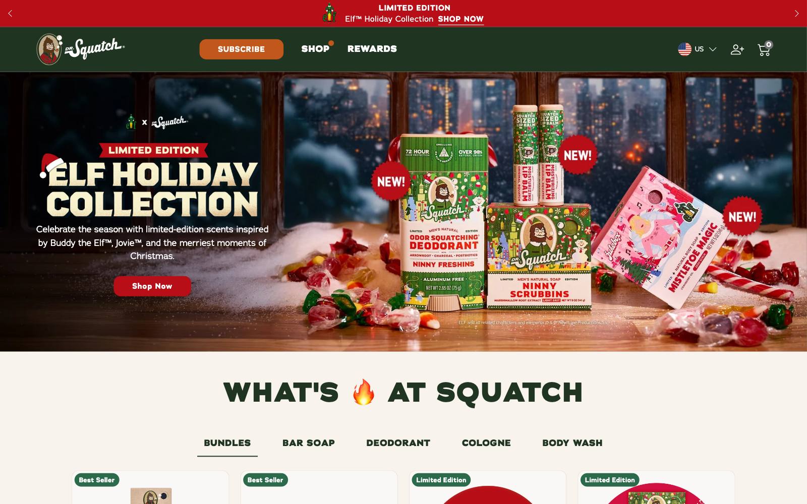
What they did: Dr. Squatch added a quantity selector to its bar soap product pages and set it to 2 bars instead of 1. Before, buying several bars meant clicking Add to Cart again for each one.
Why it works: Analytics and surveys showed many customers already bought more than one bar.
The default matched what shoppers were going to do anyway, and most people keep a preselected option.
Result: Up to +54% revenue per user among soap buyers, in an A/B test run by SplitBase.
"Up to" is the best of several versions of the test. See the test.
Copy this: Check your order data for the most common quantity per product.
If it is above 1, test that number as the default.
3. GANNI: merged the email step into the main checkout form
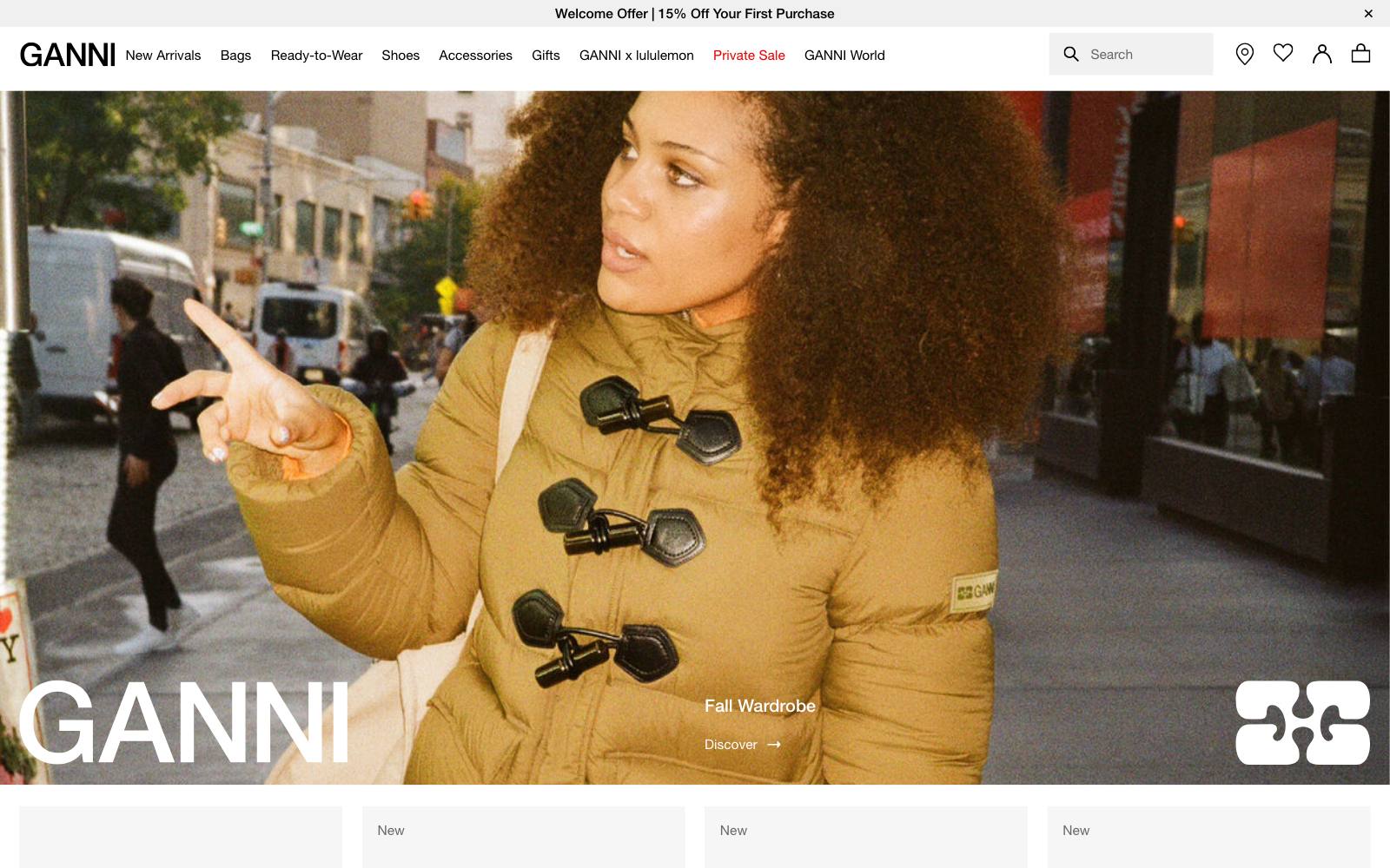
What they did: The Danish fashion brand folded its separate email-entry screen into the main checkout details form, so shoppers went straight into one form.
Why it works: One fewer screen is one fewer place to drop out.
Seeing the whole form at once also makes it clear that no account is needed.
Result: +10% at GANNI in the checkout funnel, from a test GANNI ran itself and published as a VWO case study.
An earlier GANNI test that clarified the guest option was inconclusive. See the test.
Copy this: Count the screens between your cart and payment.
Test merging any screen that asks for only one thing.
4. Liquid Death: countdown timer during a real flash sale
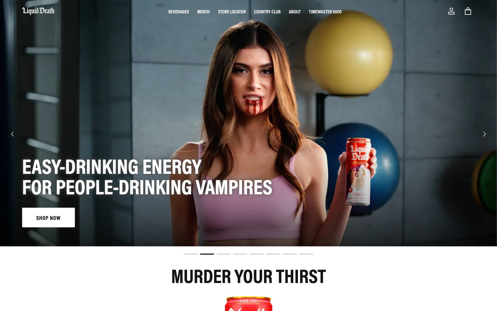
What they did: Liquid Death showed a countdown timer on its store while a time-limited flash sale was running.
Why it works: Visitors came for a limited drop, so the timer answered a question they already had: how long do I have?
The deadline was real, which keeps the timer honest.
Result: +9% conversion rate, from a test Liquid Death's own team ran and published as a Shoplift case study. See the test.
Copy this: Use a timer only when the deadline is real, and remove it the moment the sale ends.
5. Great Jones: simpler mobile homepage for first-time visitors
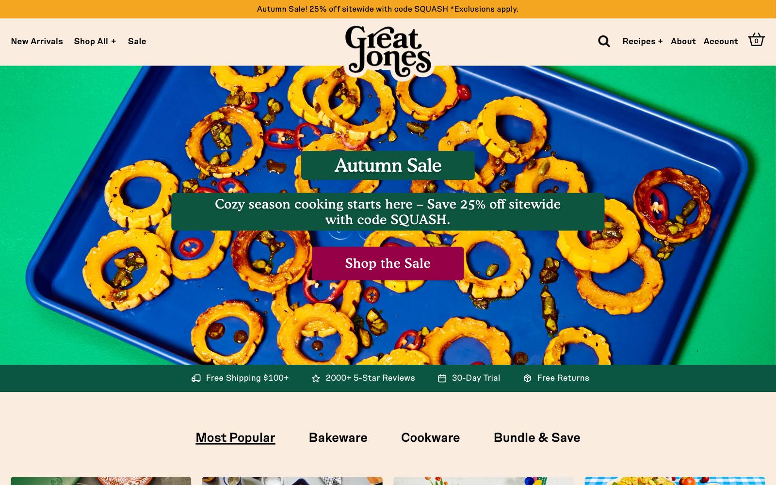
What they did: The cookware brand built a streamlined mobile homepage for new visitors, many of them arriving from paid ads and influencer posts.
Why it works: New visitors don't know the range yet.
Fewer sections on a small screen means less scrolling before the first useful click.
Result: +26.2% revenue/visitor, from Great Jones's own test, published as a Shoplift case study.
The case study does not list exactly what was removed. See the test.
Copy this: Build a shorter mobile homepage for new visitors only, and keep the full version for returning customers.
6. Kiehl's: progress gauge toward a free gift in the basket
What they did: Kiehl's added a visual gauge to its basket page showing how much more a shopper needed to spend to get a free product.
Why it works: A bar makes progress easy to read at a glance, and a free branded product can feel worth more than a small discount.
It shows up right when people decide whether to add one more item.
Result: +31% revenue and +25% purchases, from a test Kiehl's digital team ran and published as a VWO case study. See the test.
Copy this: Set your gift or free-shipping threshold just above your current average order value and show progress in the cart.
7. Zalora: reworded perks to start with "Free"
What they did: Zalora changed its product page labels from "Delivery above $150" and "30 Days Return" to "Free Delivery above $150" and "Free 30 Days Return".
Customer service had found many shoppers didn't know returns were free.
Why it works: Shoppers read the first word first.
Leading with "Free" puts the benefit ahead of the condition, which matters most for fashion buyers worried about fit.
Result: +12.3% checkouts, in a test published as a VWO case study.
Zalora's team had the idea and Wingify Services set it up. See the test.
Copy this: Rewrite each perk on your product page so the benefit is the first word.
8. schuh: moved the in-store pickup button above the fold
What they did: The UK footwear retailer moved its "Collect or Reserve" button into the first screen of the product page, next to the main buying options.
Why it works: Some shoppers want the shoes today.
Putting pickup next to Add to Bag gives them that choice without scrolling.
Result: +19.7% conversions on the Collect or Reserve button, with no reported effect on Add to Bag. schuh's in-house team ran it, published as a VWO case study.
The metric is button clicks, not store sales. See the test.
Copy this: If you have stores, show pickup on the first screen of the product page and track whether online orders hold steady.
9. Hanna Andersson: toddler-sized first image for visitors from the toddler section
What they did: The children's clothing brand showed the first product image in a toddler size to visitors who came from the toddler section, instead of a size for an older child.
Why it works: Parents want to see the item as it will look on their own child.
Matching the image to where the visitor came from answers that without a click.
Result: +22% purchase rate on the tested items, plus about +8% listing page clicks.
Hanna Andersson ran the test, published as a VWO case study.
Only a few toddler items were in the test. See the test.
Copy this: Match your first product image to the category or ad the visitor came from.
10. Muc-Off: replaced brand copy with a product image slider above the fold
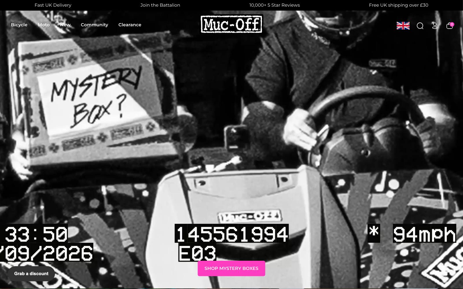
What they did: The bike and vehicle cleaning brand swapped the brand information at the top of a category page for a slider of product images, so visitors saw products first.
Why it works: People land on a category page to pick a product, not read about the brand.
Moving products up shortens the path to a product view.
Result: +106% sales and +43.78% product views, from a test Spot Studio ran, published as a VWO case study.
No sample size was shared, so treat the size of the lift with care. See the test.
Copy this: Look at what fills the first screen of your category pages.
If it isn't products, test moving products up.
11. Ashley Furniture: asked for the address before checkout instead of inside it
What they did: Ashley Furniture asked logged-in users with no saved address to add one before they entered checkout, taking the address step out of the purchase funnel.
Why it works: Furniture orders need a delivery address, but typing it mid-checkout adds friction at the worst moment. Moving it earlier made checkout itself shorter.
Result: +15% conversions and a 4% drop in bounce rate, from a test AB Tasty ran, published as a VWO case study. See the test.
Copy this: Find any field that must be filled before payment and test collecting it earlier, where it feels like setup, not a hurdle.
12. TUSHY: selling points placed above the Add to Cart button
 Visually
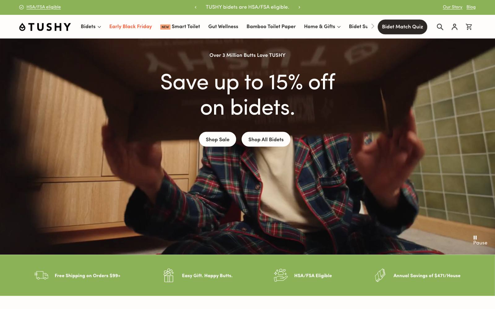
What they did: The bidet brand put a short set of selling points above the Add to Cart button, still above the fold. That pushed the button a little lower.
Why it works: A bidet is an unfamiliar purchase for many people.
Reasons to buy before the button did more than keeping the button as high as possible.
Result: +20% CR, in an A/B test Visually ran and published as a case study. See the test.
Copy this: If your product needs explaining, test three short selling points directly above Add to Cart.
13. The Oodie: similar products on sold-out pages
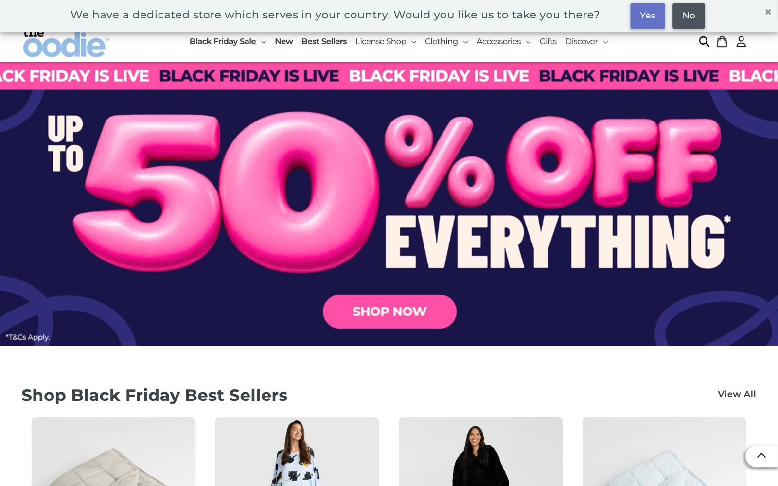
What they did: The loungewear brand added a block of similar products to out-of-stock product pages, which before only offered a notify-me button.
Why it works: A sold-out page is a dead end.
Similar items give the shopper something to buy today instead of waiting.
Result: +9.5% conversion rate, in a test Visually ran with The Oodie.
DRIP Agency saw the same pattern at Oceansapart: +11.6% conversion, +21.7% RPU. See the test.
Copy this: Keep out-of-stock pages live and add a row of similar products under the notify-me option.
14. Hyperice: side-by-side comparison of Hypervolt models
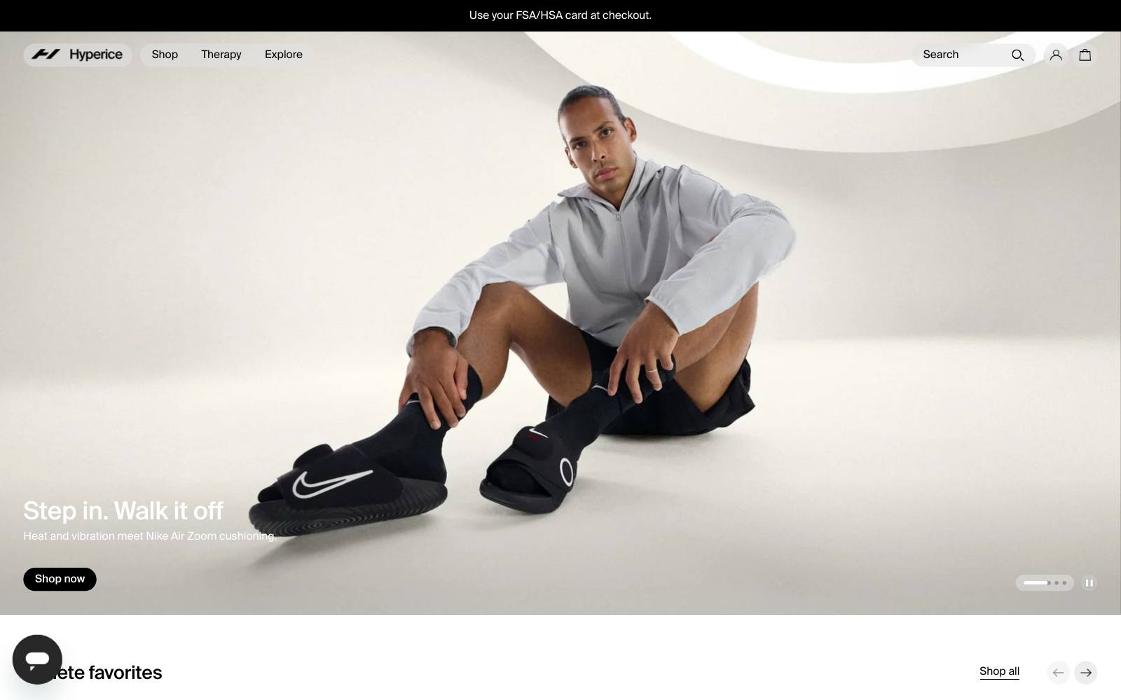
What they did: Hyperice added a feature that lets visitors compare its Hypervolt massage gun models side by side.
Research had shown mobile shoppers struggled to tell the models apart.
Why it works: When products look alike, shoppers stall while trying to pick.
A comparison makes the choice, and the reasons to pay more, clear.
Result: +6.2% conversion rate, in an A/B test SplitBase ran for Hyperice. See the test.
Copy this: If you sell several versions of one product, test a simple comparison table on each product page.
15. Decathlon: "Recently viewed" count under the review stars
What they did: Decathlon UK added one line under the review stars showing how many shoppers had viewed the product recently.
It only appeared once a product passed 20 views, across 400 product pages.
Why it works: A real count tells shoppers others are interested, without making a claim the store can't back up.
It worked best for returning visitors and items under 10 pounds.
Result: +2.4% transactions and +1.3% revenue, from Decathlon UK's own test, published as a VWO case study. See the test.
Copy this: Show real activity counts only after a minimum threshold, so low numbers never appear.
16. Ulta Beauty: recommendation overlay after add to bag
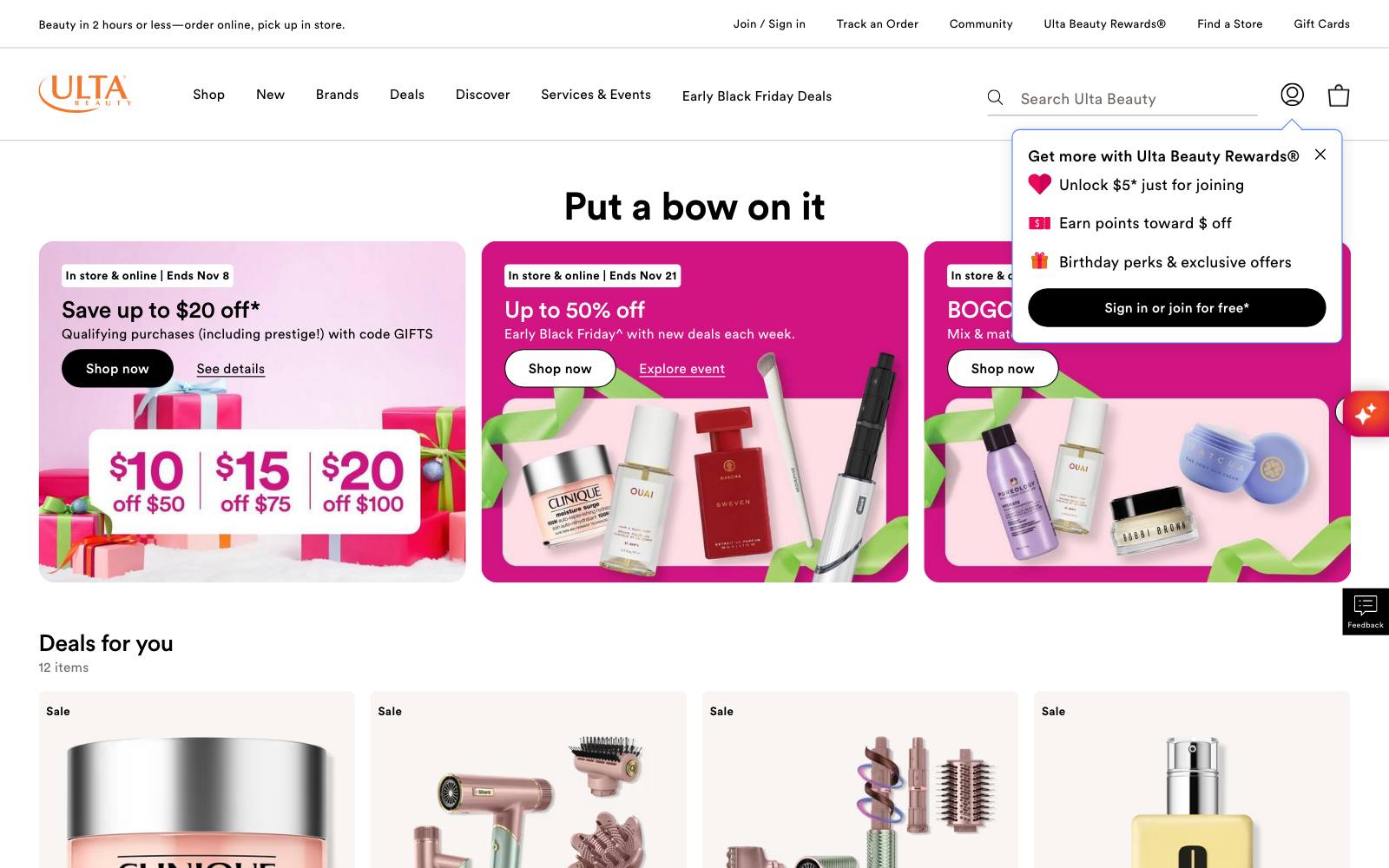
What they did: When a guest added an item to the bag, Ulta Beauty showed an overlay with the products most relevant to that guest.
Why it works: Right after adding an item is when a shopper is most open to a second one.
The overlay offered it without sending them anywhere.
Result: +9% revenue, +15.1% add-to-bag clicks and +2.3% conversion rate, from Ulta Beauty's own test, published as a VWO case study. See the test.
Copy this: Test a short set of related items in your add-to-cart confirmation, and check conversion rate didn't drop.
17. Fishwife: tested accordion vs slider for product page content
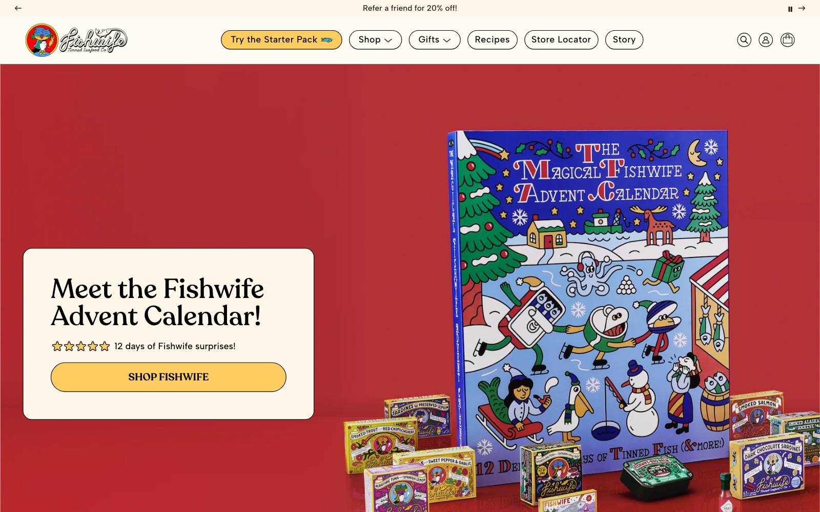
What they did: The tinned fish brand tested an accordion against a slider for the same product page content.
One version got more engagement but less revenue, and the team chose on revenue.
Why it works: The layout that gets the most clicks isn't always the one that sells the most.
Picking the winner on revenue kept the team honest.
Result: +5.8% revenue per visitor for the version Fishwife shipped, from its own team's test, published as a Shoplift case study.
The source doesn't say which layout won. See the test.
Copy this: Choose your primary metric before the test starts, and make it money, not clicks.
18. Kickz: numbered pagination instead of infinite scroll
 DRIP Agency
What they did: The German sneaker retailer replaced infinite scroll and a "Load more" button with classic numbered pages on its listing pages.
Why it works: Page numbers give shoppers a sense of where they are and let them come back to a spot.
That helps on big catalogs where people compare many items.
Result: +10.3% RPU, from a test DRIP Agency ran for Kickz and published on its own site. See the test.
Copy this: On a large catalog, test numbered pages against infinite scroll and measure revenue per user.
19. Peak Design: free shipping only on orders of $99+
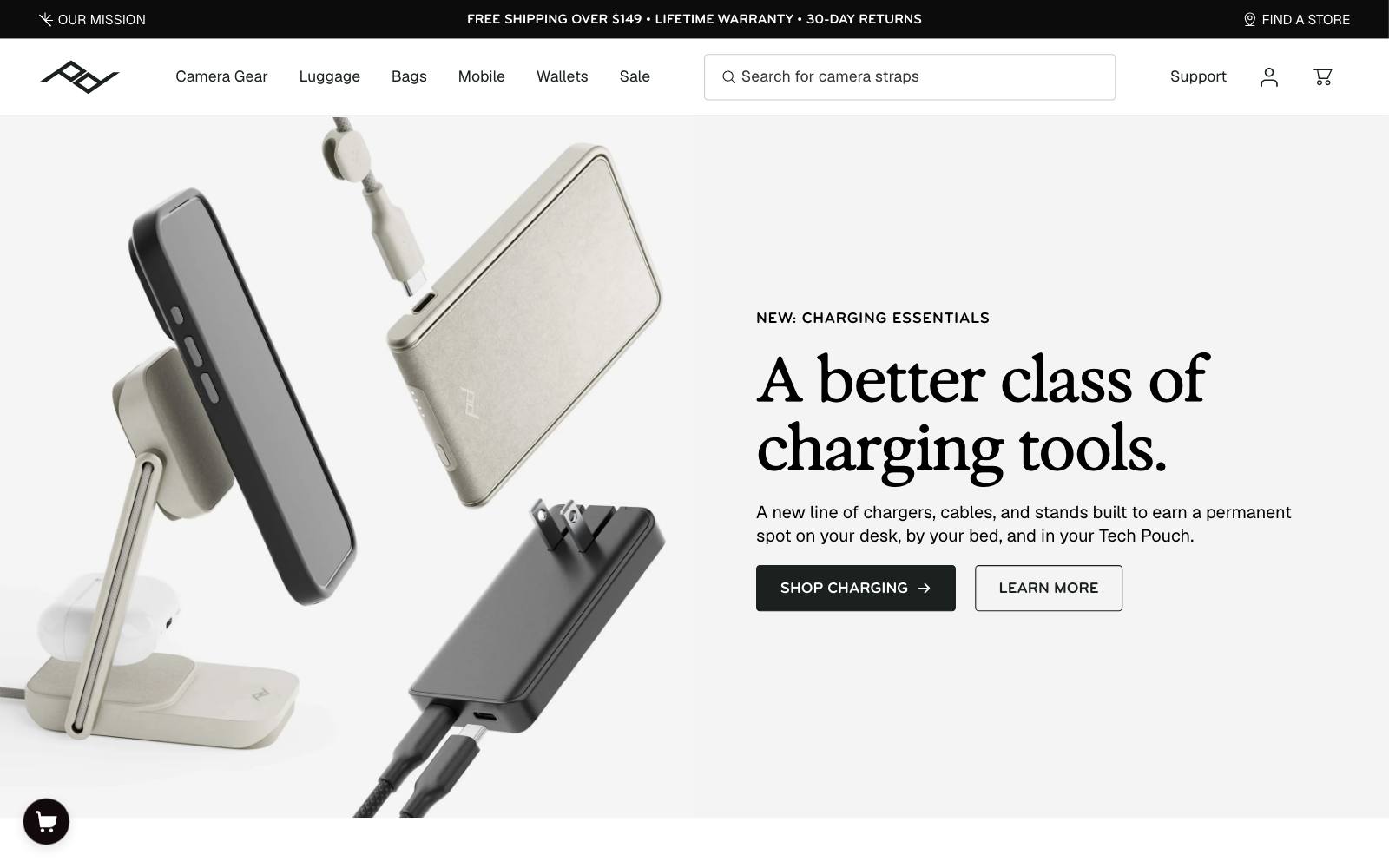
What they did: Peak Design replaced free shipping on all US orders with free shipping only on orders of $99 or more.
Why it works: A threshold just above typical order size nudges people to add one more item.
It can also put off small orders, so this is a trade-off, not a free win.
Result: +17% AOV, from a 26-day before-and-after comparison by Surefoot, not a split test.
Net revenue was not statistically different, but the brand stopped paying for shipping on small orders. See the test.
Copy this: Before adding a threshold, model the margin on small orders you might lose against the shipping cost you save.
20. Hunter Boots: product popularity messages on product pages
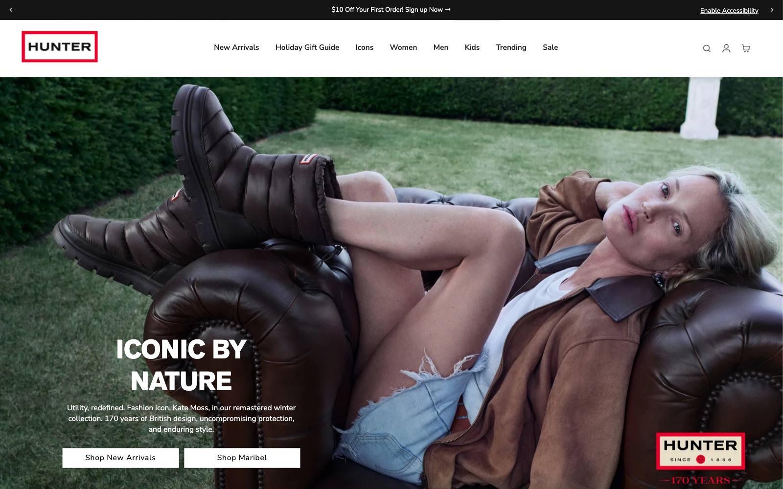
What they did: Hunter Boots showed messages about a product's popularity on product pages, with the wording tuned separately for UK and US shoppers.
Why it works: Popularity is a shortcut when shoppers are unsure.
Tuning the message by market mattered: view counts meant more to US shoppers.
Result: +9% conversion (UK) and +6% in the US, from a test Conversio ran with AB Tasty's social proof feature, published as a VWO case study. See the test.
Copy this: If you sell in more than one country, measure social proof results by market instead of pooling them.
Patterns across the winners
Answer shipping and returns questions early
Zalora's "Free" wording and Kiehl's gift gauge both put the reward in front of shoppers before they had to ask. See more free shipping threshold tests.
Let the default do the work
Dr. Squatch preset two bars and Hanna Andersson matched the first image to the visitor's section.
Both made the likely choice the easy one.
Show products sooner
Muc-Off moved products above brand copy and Great Jones cut its mobile homepage for new visitors.
Shoppers came to shop, so the page got out of the way.
Cut steps from checkout
GANNI merged two screens and Ashley Furniture moved the address step out of checkout. Fewer screens meant fewer places to quit.
Never leave a dead end
The Oodie filled sold-out pages with similar products and Ulta Beauty suggested items right after add to bag. Each gave the shopper a next step.
Use real signals, not invented ones
Liquid Death's timer counted down a real sale and Decathlon only showed view counts above 20. Honest social proof and countdown timers can win without misleading anyone.
Examples that lost (what not to copy)
Not every change works. These tests lost or showed no clear effect, and they are just as useful.
- Levain Bakery, large price increase: revenue per visitor fell, so the brand dropped it and tested a smaller rise, which did slightly better. ABConvert ran both tests. See the test. More on price testing.
- The Shade Store, swatch navigation: about -82%, stopped. Orders of its most popular swatches dropped so fast that Surefoot stopped the test early. See the test.
- Loop Earplugs, engraved case at checkout: -3.04% conversion rate. Shoppers clicked the €6 add-on, but the extra choice cost more orders than it added. Dash of CX ran it. See the test.
- SAXX, 5% price increase: no change in conversion. This is a flat result, not proof the price rise had no effect. SAXX's own team ran it, published as a Shoplift case study. See the test.
- GANNI, clarifying guest checkout: inconclusive. The bigger win came later, from merging two checkout steps. See the test.
 ABConvert
 Surefoot
How to test this on your own site
- Pick one pattern that fits a real problem. Use your analytics or customer questions, the way Hyperice found shoppers couldn't tell its models apart.
- Choose one main metric first. Revenue per visitor is the safest for most sites. Fishwife's test shows why clicks can mislead.
- Run it as an A/B test, not a before-and-after. Seasonality and ad spend change week to week, which can hide or fake a lift.
- Let it run full weeks. Weekday and weekend shoppers behave differently.
- Check the downside. Peak Design gained order value, but a threshold can cost you small orders. Look at conversion and order count, not just the headline number.
Our ecommerce CRO guide covers how to set up a program.
Oliver Kenyon runs hands-on CRO for ecommerce brands, and agencies with many tests in our archive include Visually and DRIP Agency.
Watch out for
- Copying the result, not the reason. Dr. Squatch's default of two worked because customers already bought two. If your customers buy one, a preset of two may annoy them.
- Fake urgency. Liquid Death's timer counted down a real sale. Timers that reset on reload damage trust once shoppers notice.
- Discount dependence. Gift gauges and promo banners can train shoppers to wait for offers. Watch margin, not only revenue.
- App stacking and page speed. Each overlay, recommendation widget and social proof app adds scripts. Test speed on mobile after every addition.
- Thin evidence. Many published case studies don't share sample size or confidence. Treat big numbers, like Muc-Off's +106% sales, as a reason to test, not a forecast.