



The best product page examples share five habits: a gallery that shows the product in use, a price block that makes the value obvious, reviews right next to the buy button, an add-to-cart button that never scrolls out of reach, and a clear delivery date.
Customer photos placed next to the main images lifted conversion 71.14% for Titan Casket, and a Trustpilot widget under Add to Basket lifted purchases 58.29% for Express Watches.
Below are 21 examples, 18 of them A/B tests from our archive.
How we picked: we pulled product page tests from the LiftArchive product page test database, kept results with a clear number and a named team, and added three live product pages we loaded in November 2026. We did not run these tests ourselves; each result is credited to the team that ran it.
Most examples come from ecommerce brands, because that is where product pages live.
The same ideas carry over to SaaS plan pages and app store listings.
For the full design method, read our product page design guide.
What makes a good product page example
A good example answers the questions a shopper has just before buying: what does it look like in real life, is the price fair, do other people like it, and when will it arrive.
Each entry below shows one answer, what changed and what happened.
Several did not share sample sizes, and we say so.
Summary of all 21 examples
| # | Example (brand or page) | What they did | Result | Type |
|---|---|---|---|---|
| 1 | Titan Casket | Customer photos moved next to the main images | +71.14% conversion | Ecommerce |
| 2 | Liberté | Sandal shown worn in the lead photo | +44% conversion | Ecommerce |
| 3 | BLACKROLL | Numbered, labeled shots of massage gun heads | +11.3% conversion | Ecommerce |
| 4 | Little Bible Stories | Thumbnails under the mobile gallery | +6.14% conversion | Ecommerce |
| 5 | INH Hair | Three how-to GIFs | +26% conversions | Ecommerce |
| 6 | Gymshark | Model size and fit data by the size picker | Live example, not tested | Ecommerce |
| 7 | Stone Creek Coffee | "Save X% per oz" on bigger bags | +41% conversion rate | Ecommerce |
| 8 | Royal Discount | Bigger, bold sale price | +36.5% add-to-cart clicks | Ecommerce |
| 9 | Revival Rugs | Percent saved next to the sale price | +11.5% add to cart | Ecommerce |
| 10 | Huel | Price per meal next to the bag price | Live example, not tested | Ecommerce |
| 11 | Express Watches | Trustpilot widget under Add to Basket | +58.29% purchases | Ecommerce |
| 12 | Singular Sound | Product-specific review high on the page | +19.14% conversion rate | Ecommerce |
| 13 | Supergut | Testimonials below Add to Cart | Up to +20.35% conversion | Ecommerce |
| 14 | Aeromotive | Sticky add-to-cart bar on desktop | +69% revenue per visitor | Ecommerce |
| 15 | Jackson's | Sticky Add to Cart bar | +47.6% conversion | Ecommerce |
| 16 | Ursa Major | Sticky add-to-cart on mobile | +5.1% revenue per visitor | Ecommerce |
| 17 | Sparify | Estimated shipping timeline | +12.24% revenue | Ecommerce |
| 18 | TryAuri | Delivery-date tag next to add to cart | +3.82% conversion rate | Ecommerce |
| 19 | Showpo | Free-shipping strip on mobile | +6.09% revenue | Ecommerce |
| 20 | Premium product page (Oliver Kenyon) | Free shipping and returns line under Add to cart | +$75,600 per month (forecast) | Ecommerce |
| 21 | Allbirds | Fit advice and a style comparison on the page | Live example, not tested | Ecommerce |
The 21 best product page examples
1. Titan Casket: customer photos next to the main images
What they did: On mobile, the customer photos section used to sit far below the gallery.
The test moved it up next to the main product images, and made the "See customer photos" link more visible on desktop.
Why it works: A casket is a high-stakes purchase that nobody can see in person.
Photos from real buyers answer "what will it actually look like" better than studio shots.
Result: +71.14% conversion, run by Blend Commerce. Revenue per visitor rose 24.40%.
The test ran two weeks; sample size was not shared, so expect the lift to shrink.
Copy this: If you collect customer photos, show them beside or inside your gallery, not at the bottom of the review section.
2. Liberté: the sandal shown on a foot, not on white
 Elevate_ab
What they did: The Amalfi Sandal page used to open on a white-background product shot.
The variant led with a model wearing the sandal in a styled home.
Why it works: Footwear is hard to judge flat.
A worn photo shows fit, scale and style in one glance.
Result: +44% conversion (2.77% to 3.99%), run by Elevate_ab.
One product, and no sample size or significance was shared.
Copy this: Test your first gallery image. Try the product in use as image one on your top seller.
Note that the opposite swap lost for another apparel store (see "Examples that lost" below), so test, don't assume.
3. BLACKROLL: numbered, labeled attachment shots
 DRIP Agency
What they did: A lifestyle image of the fascia gun heads was replaced with clear, numbered shots of each head, each with a short line on what it is for.
Why it works: Shoppers could not tell what the attachments did.
Labels turned a pretty image into an answer.
Result: +11.3% conversion, run by DRIP Agency. Revenue per user rose 10.4%. Sample size and confidence were not shared.
Copy this: For any product with parts, sizes or accessories, add one gallery image that labels each part in plain words.
4. Little Bible Stories: thumbnails instead of dots
What they did: The mobile gallery used small dots, so shoppers could not see what each image showed.
The variant added a row of thumbnails below the main photo.
Why it works: Thumbnails show there is more to see and let shoppers jump to the image they care about.
Result: +6.14% conversion, run by Blend Commerce. Revenue per visitor rose 7.09%.
Mobile only, where 92% of the brand's traffic came from.
Copy this: If your mobile gallery uses dots, test a scrollable thumbnail strip.
5. INH Hair: show how it is used
 SplitBase
What they did: Usability tests showed visitors from Instagram and TikTok were not reading the written how-to for a clip-in ponytail.
The team tested GIFs, videos and images, and three short GIFs won.
Why it works: "Is this hard to use?" is a quiet objection.
A few seconds of motion answers it faster than a paragraph.
Result: +26% conversions, run by SplitBase. The 26% covers several product page iterations, so this one test may not account for all of it.
Copy this: If customers ask "how does it work" in support tickets, add a short looping GIF or video to the gallery.
6. Gymshark: fit data next to the size picker
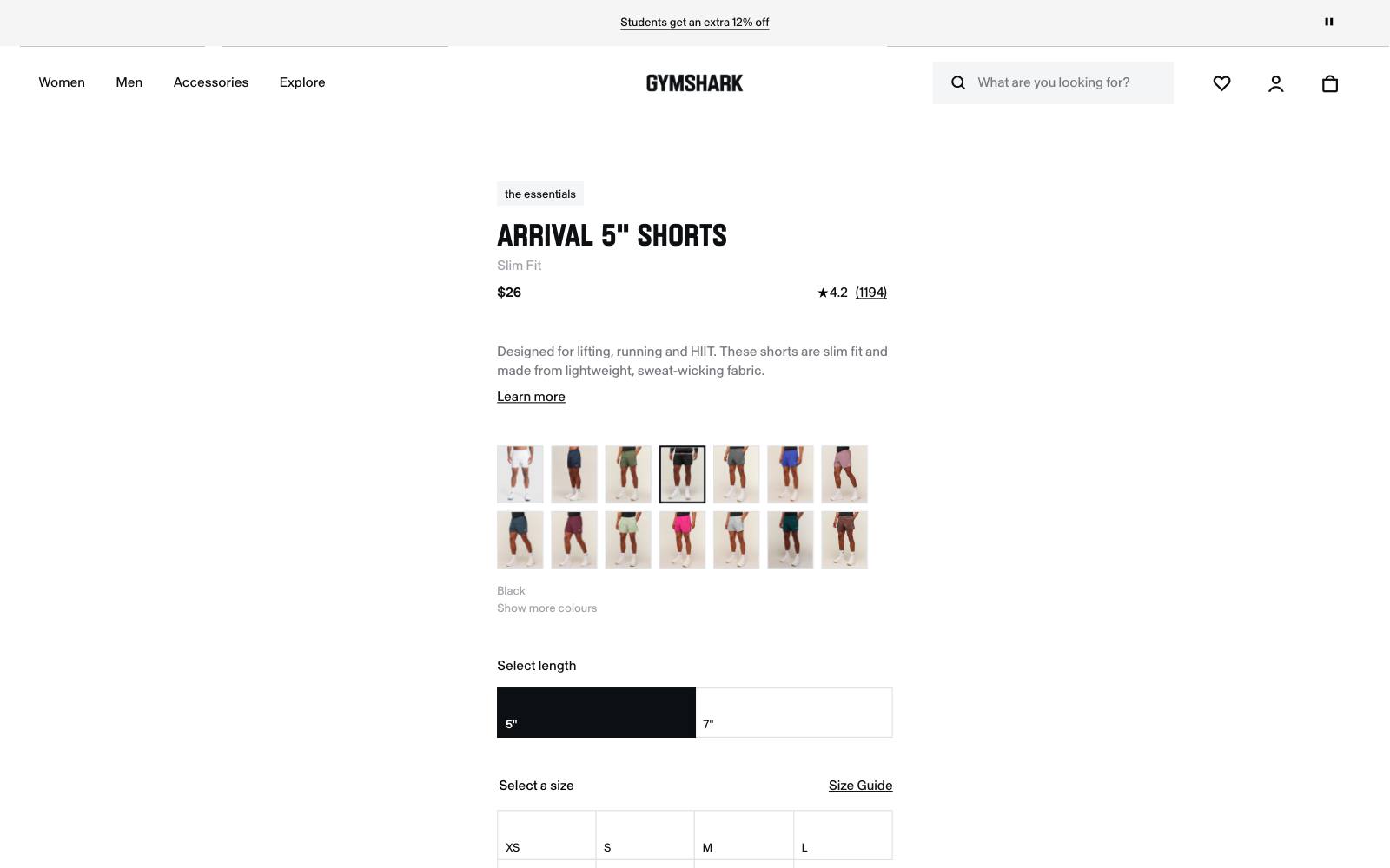
What they did: On the Arrival 5" Shorts page, Gymshark lists the model's height and size ("5'10" and wears size M"), the inseam (based on size M), and a line from reviews that most reviewers say the product is true to size.
A free standard delivery threshold and an express delivery option sit on the page too.
Why it works: Fit worry is a common reason apparel shoppers hesitate.
Model size plus reviewer fit data answers it without a size chart.
Result: Live example, not tested. In our archive, Dave Diederen tested a model size overlay on product images, which won +4.61% revenue per visitor.
Copy this: Put the model's height and size on or under the first image, and add a "true to size" line from your reviews.
7. Stone Creek Coffee: savings per ounce on bigger bags
What they did: Picking a bag size used to update the price but never said what a bigger bag saved.
The variant added "Save X% per oz" labels to the 2 lb and 5 lb options, updating as shoppers changed size or switched to subscription.
Why it works: Unit savings make the bigger option feel like the smart choice without a discount.
Result: +41% conversion rate, run by Blend Commerce, statistically significant.
Revenue per visitor rose 26%, but average order value fell 10%, likely from more (smaller) subscription orders.
Copy this: If you sell sizes or packs, show savings per unit on each larger option. Watch order value.
8. Royal Discount: a bigger, bolder sale price
What they did: The sale price on a software product page went from 15px regular to 20px bold. The crossed-out list price stayed the same.
Why it works: The deal was there all along.
Making the sale price the most visible number made the saving obvious.
Result: +36.5% add-to-cart clicks, run by Fruition on VWO.
Revenue rose 10.21%, but that had not reached significance when first reported.
Copy this: Check whether your sale price is the boldest number in the buy box. If not, make it so.
9. Revival Rugs: the percent saved, spelled out
 Prismfly
What they did: Product pages showed the original and sale price together.
The variant added the percent saved next to them and moved the star rating to its own line.
Why it works: Shoppers don't do math in the buy box. "You save 40%" does it for them.
Result: +11.5% add to cart, run by Prismfly.
Conversion rate rose 9%. The rating moved too, so the lift is not purely from the label.
Copy this: Show the saving as a label next to the sale price.
Dave Diederen has seen both percent and dollar framing win in different stores, so test which format fits your prices.
10. Huel: price per meal, not just price per bag
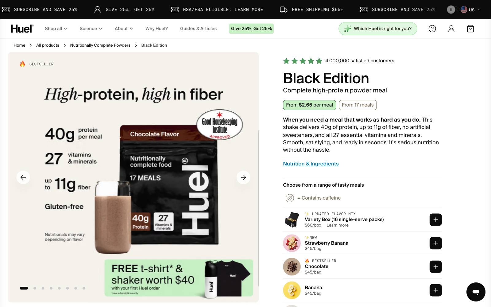
What they did: The Huel Black Edition page leads with "From $2.65 per meal" and shows the per-meal cost for one-time and subscription options, next to the bag price.
Free shipping over $65 and a "Love it or your money back" guarantee are on the page.
Why it works: A $45 bag sounds like a lot.
A meal under $3 sounds cheap. The unit price changes what the shopper compares it to.
Result: Live example, not tested. In our archive, Blend Commerce found that showing the price per dose next to the pack price lifted revenue per visitor 17.76% for a sports nutrition brand.
Copy this: If your product is used up over time, show the price per use, dose or meal under the main price.
11. Express Watches: reviews right under the buy button
What they did: The page had a small Trustpilot badge.
The variant placed a larger Trustpilot widget with real reviews directly under Add to Basket.
Why it works: An online watch dealer has to prove it is real and safe.
Proof placed where the shopper decides does more than proof in the footer.
Result: +58.29% purchases, run by High Position on VWO, at 99% significance over more than two months.
Copy this: Put your overall rating, with a few real reviews, in the space just below the add-to-cart button.
More ideas in our product page review tests.
12. Singular Sound: the right review, high on the page
What they did: An A/B/C test added one review to the top of the product page.
Variant 1 praised sound quality and performance. Variant 2 praised the brand.
Why it works: The product review answered "is it good?"
The brand review did not, and it lost.
Result: +19.14% conversion rate for the product review, run by Blend Commerce.
The brand review raised add-to-cart 23.68% but cut conversion 7.38%.
Copy this: Pick a review that answers your product's biggest doubt, not a generic "great company" quote.
13. Supergut: testimonials below Add to Cart
 Visually
What they did: Testimonials written about that specific product were placed directly below the Add to Cart button.
Why it works: Supplements carry the "will it work for me" doubt.
A product-specific testimonial at the button answers it at the moment of choice.
Result: Up to +20.35% conversion, run by Visually.
That was the best page; every page tested lifted, but a typical page likely gained less.
Copy this: Place one or two short, product-specific testimonials under the button on your top sellers.
14. Aeromotive: a sticky add-to-cart bar on desktop
What they did: Shoppers reading specs and fitment details lost sight of the buy button.
The variant kept a sticky bar with product name, price and add-to-cart on screen.
Why it works: Long, technical pages push the button away.
A sticky bar lets people buy the moment they are convinced.
Result: +69% revenue per visitor, run by Blend Commerce.
Begin-checkout rose 4%. Conversion rate was not reported, and revenue metrics swing with a few big orders, so treat the size with care.
Copy this: If your product page is long, test a sticky bar on desktop as well as mobile. See sticky add-to-cart tests.
15. Jackson's: a plain sticky bar beat a discount sticky bar
What they did: An A/B/C test added a sticky bar.
One version said Add to Cart. The other promoted 10% Subscribe & Save.
Why it works: Both beat the control, but the simple version won.
A sticky bar is for buying, not for a second offer.
Result: +47.6% conversion for the plain bar, run by Blend Commerce.
The Subscribe & Save bar lifted conversion 28.56%. No significance or sample size was shared.
Copy this: Keep your sticky bar to one action: add to cart.
16. Ursa Major: sticky add-to-cart on mobile
What they did: A sticky add-to-cart button stayed on screen as mobile shoppers scrolled.
Why it works: On a phone, the buy button disappears after one swipe.
Result: +5.1% revenue per visitor on mobile, run by UN/COMMON on Shoplift. Statistically significant, and rolled out site-wide.
Copy this: A modest, significant lift is a better guide than a huge, unproven one.
Start here if you have no sticky button yet.
Note that a bottom sticky button was flat for another store (see "Examples that lost").
17. Sparify: an estimated shipping timeline
What they did: Product pages gave no sense of when an order would arrive.
The variant showed an estimated shipping timeline based on current inventory.
Why it works: "When will I get it?" is often the last question before buying.
A date turns a vague promise into a plan.
Result: +12.24% revenue, run by ConvertPolo on VWO.
Mobile CTA clicks rose 4.7%. No sample size was shared.
Copy this: Only show dates you can keep.
Tie the estimate to real stock and carrier data.
18. TryAuri: a delivery-date tag beside the button
What they did: The page said "Fast Shipping" but never when.
The variant added a dynamic estimated delivery date next to add to cart, designed mobile-first.
Why it works: A specific date beats a vague adjective.
Result: +3.82% conversion rate at 95% confidence, run by Vasta. Revenue per visitor rose 5.69%.
Copy this: Replace "Fast shipping" with "Get it by [date]".
Dave Diederen saw a similar "Ships by" date plus free-shipping threshold win +28.25% revenue per visitor.
19. Showpo: a free-shipping strip, without the popup
What they did: Mobile product pages got a free-shipping strip showing how much more the shopper needed to spend. A second version added a popup.
Why it works: The strip nudged shoppers to add more items. The popup hid it and did worse.
Result: +6.09% revenue on mobile over 44 days for the strip alone, run by VWO.
Copy this: Show the free-shipping gap on the product page itself. Don't cover it with a popup.
20. Oliver Kenyon: one line of shipping and returns under the button
What they did: A premium product page (shown with a $1,000 product) had no shipping or returns note near the button.
The variant added one slim line, "Complimentary Shipping and Returns", right under the buttons.
Why it works: At high prices, the cost of a wrong choice is the worry.
Free returns, stated at the button, removes it.
Result: +$75,600 per month, run by Oliver Kenyon.
This is a forecast, not measured revenue, and the percentage lifts were not shared.
Copy this: Put your strongest delivery or returns promise in one line directly under add to cart.
Note that a long return policy block lost elsewhere; keep it short.
21. Allbirds: fit advice and a style comparison
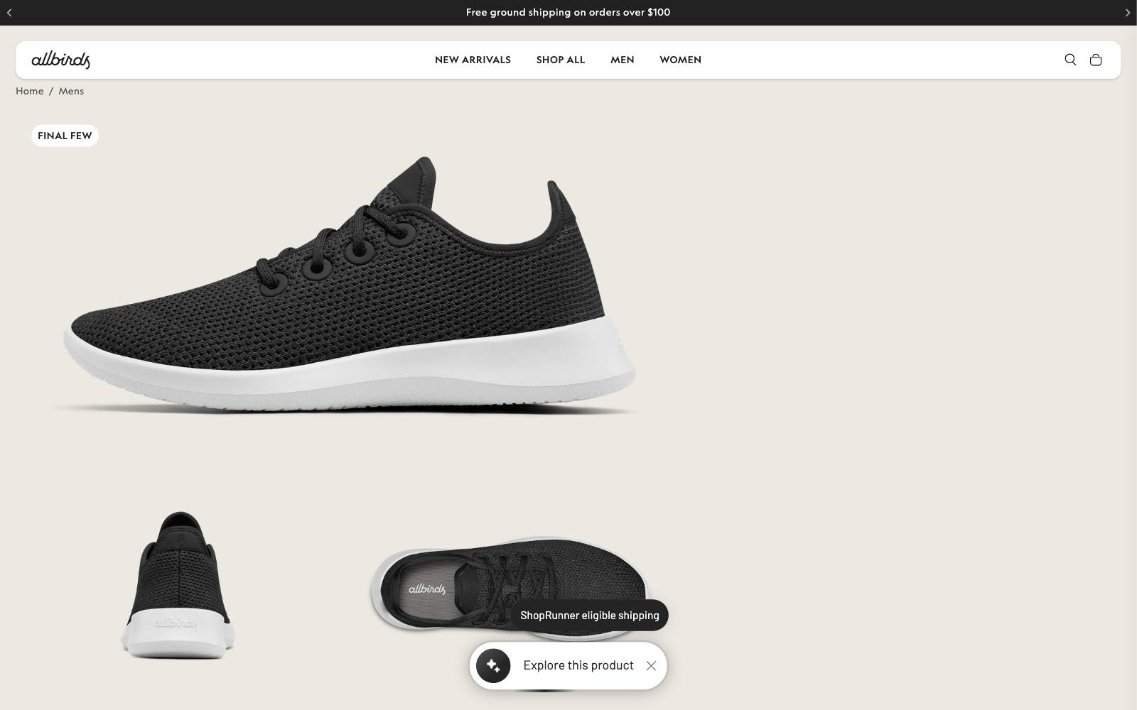
What they did: The Men's Tree Runner page tells shoppers the shoe "tends to run small" and recommends sizing up.
It shows "Free shipping" under the price, and a "Compare our styles" section sets it against a sister model on fit and cushioning.
Why it works: It answers the two questions a shoe buyer has: which size, and which model.
A shopper who can't decide between two styles often buys neither.
Result: Live example, not tested. In our archive, a side-by-side model comparison lifted conversion rate 6.2% for Hyperice, run by SplitBase.
Copy this: If you sell similar products, add a short comparison on each page so shoppers can choose without leaving.
Patterns that show up across the winners
Answer the doubt at the button
The biggest review wins (Express Watches, Supergut) put proof right under add to cart, not in a section further down.
The same is true for shipping and returns lines (Oliver Kenyon, TryAuri).
Show the product in real life
Customer photos, worn shots, labeled parts and how-to GIFs all beat polished but vague images. The common thread is clarity, not style.
Do the math for the shopper
Savings per ounce, percent saved and a bigger sale price all made value obvious. None of them changed the actual price.
Keep the button in reach
Sticky bars won for Aeromotive, Jackson's and Ursa Major.
The plain version beat the one with an extra offer.
Be specific about delivery
A date beats "fast". A spend gap beats "free shipping available".
Both work best as a short line, not a block.
Examples that lost (what not to copy)
These used the same patterns and still lost or went flat.
- Lifestyle photos instead of model shots: -7.2% conversion rate for an apparel store, run by Clean Commit. Not significant (8,808 visitors over 35 days), but desktop fell hardest.
- Testimonials next to the title and price: -9.2% conversion rate and -15.3% revenue per visitor, run by Clean Commit. Clicks on the block rose, purchases did not.
- Return policy added near add to cart: -6.0% conversion rate, run by Clean Commit. Not significant, but down on both mobile and desktop.
- Bottom sticky add-to-cart on mobile: flat. Add-to-cart rose 6.8% but conversion fell 7.7%, run by Clean Commit.
- Price added to the Add to Cart button: -2.03% revenue per visitor after more than 2,000 orders, run by Dave Diederen.
- 2-pack changed to 'Buy 2 Get 1 Free' at the same price: -52.38% revenue per visitor, run by Milos. Conversion fell 51.36%.
The pattern: more content near the button is not always better.
A short, specific line can win where a block of text loses, and a more generous offer can confuse shoppers.
 @CROguy_
 Clean CommitClean CommitClean Commit
Real results: the strongest product page wins
 @oliverkenyon
 Vasta
 Blend CommerceBlend Commerce
How to test this on your own site
- Start with your top product. It has the traffic to reach a result. Use our product page checklist to spot gaps.
- Pick one pattern. Gallery, price block, reviews, sticky button or delivery date. Test one at a time so you know what moved the number.
- Judge on revenue per visitor or conversion, not clicks. Several losers above raised add-to-cart and still lost sales.
- Run full weeks and wait for enough orders.
- Check mobile and desktop separately. Titan Casket, Clean Commit's image test and Showpo all saw different effects by device.
For more ideas, browse the best product page tests or the full list of examples.
If you would rather have someone run these tests for you, Oliver Kenyon has run many of the product page tests in our archive; see the Oliver Kenyon practitioner page.
Watch out for
- App stacking. Review widgets, sticky bars and delivery-date apps each add scripts. Check page speed after each one; see our page speed guide.
- Fake delivery dates or stock counts. A missed "arrives by" date costs more trust than it won. Only show what your stock and carriers support.
- Discount dependence. Several winners framed value better without cutting the price. Try framing before you try discounts.
- Big lifts with no sample size. Treat +50% results as a reason to test, not a forecast.