




The testimonial examples that actually lifted results in real A/B tests share three traits: they sit next to the decision (the form, the sign-up button or the add-to-cart), they are short and specific, and they come from someone the visitor sees as like them.
The strongest tested examples below are a student quote above a brochure form (+50% submissions), testimonials added to a SaaS sign-up page (+56.94% completion) and three short quotes on a sales page (+34% purchases).
How we picked: every tested example comes from the A/B tests in our archive, with numbers copied from the original source.
The two live pages we loaded ourselves; they are not tested.
We note when a test changed several things at once.
For the full set of results, see our testimonials test archive, or browse more conversion examples.
Summary of every testimonial example
| # | Example (brand or page) | What they did | Result | Type |
|---|---|---|---|---|
| 1 | Hotel Institute Montreux, brochure form | Student testimonial above the form | +50% submissions | Lead gen |
| 2 | Mida, sign-up page | Testimonial blocks next to the form | +56.94% sign-up completion | SaaS |
| 3 | WikiJob, practice-test sales page | Three short testimonials | +34% purchases | SaaS |
| 4 | Laura Roeder, newsletter sign-up | Customer quote as the headline | +24.31% sign-ups | Lead gen |
| 5 | Buildium, homepage | Testimonials showing each customer's unit count | +22% sign-ups (bundled) | SaaS |
| 6 | KlientBoost client, landing page | Testimonials moved higher | 12.28% to 23.62% | Lead gen |
| 7 | KlientBoost client, landing page | Social proof plus testimonials | 33.22% to 43.52% | Lead gen |
| 8 | IMD, MBA landing page | Alumni video testimonials moved higher | +63% MBA brochure leads | Lead gen |
| 9 | Supergut, product page | Product-specific testimonials below Add to Cart | up to +20.35% conversion | Ecommerce |
| 10 | Shopify brand (Blend Commerce) | One featured review near the buy box | +39% revenue per visitor | Ecommerce |
| 11 | 7-figure Shopify brand (Dave Diederen) | One written review above the fold | +7.45% revenue per visitor | Ecommerce |
| 12 | Vegetology, product page | Description and testimonial above the fold | +6% conversion rate | Ecommerce |
| 13 | Kasper Dolk client | Testimonial on vs off | Revenue per visitor +7.10% | Ecommerce |
| 14 | Underwater Audio, homepage hero | Testimonial moved above the CTA | +35.6% sales | Ecommerce |
| 15 | Dave Diederen client, product page | Three UGC videos under add to cart | +12.2% revenue per visitor | Ecommerce |
| 16 | Goat Milk Stuff, product page | Photo reviews shown first | +3.61% conversion rate | Ecommerce |
| 17 | Dave Diederen client, checkout | Customer reviews on the checkout page | +23.13% revenue per visitor | Ecommerce |
| 18 | Tennis and racket gear brand, mega menu | Testimonial inside the menu | +$151,192/month | Ecommerce |
| 19 | Basecamp, customers page | Hundreds of quotes answering one question | Live example, not tested | SaaS |
| 20 | Notion, customer stories | Stories filtered by team size and industry | Live example, not tested | SaaS |
The 20 testimonial examples
1. Hotel Institute Montreux: a student testimonial above the brochure form
What they did: The Swiss hospitality school's free brochure page had a form and no testimonials.
The variant put one student testimonial directly above the form.
Why it works: A prospective student hears from someone who made the same choice, right at the moment they are deciding whether to hand over their details.
Result: +50% submissions, and cost per lead on AdWords fell 54%, in a test run by The Reference.
Copy this: Put one testimonial from a past customer who looks like your typical lead directly above your form, not in a separate section.
2. Mida: testimonials on the sign-up page
What they did: Mida, an A/B testing tool, added customer testimonial blocks to a sign-up page that had shown the form alone.
Why it works: Sign-up forms are where doubt peaks.
A few quotes from current users answer "is this worth my time?" without the visitor leaving the page.
Result: +56.94% sign-up completion, from about 37% to almost 60%, run by Mida. The sample was small, about 200 sign-ups.
Copy this: Add two or three testimonials beside or under your sign-up form, and re-test it because small samples swing.
3. WikiJob: three short, sober testimonials
What they did: WikiJob added three short, plain customer testimonials to its aptitude-test sales page.
An earlier test that placed them lower down had no effect.
Why it works: Short quotes get read. Placement mattered here too: the same proof did nothing when it was buried.
Result: +34% purchases, run by WikiJob.
Copy this: Cut your testimonials to one or two sentences each, show three, and put them where visitors decide.
4. Laura Roeder: a customer quote as the headline
What they did: The homepage newsletter headline "Could You Use a Free Plan For Promoting With Social Media?" was replaced with a line from customer feedback: "Yours is the only newsletter that I actually read."
Why it works: The quote makes a claim the company could not make about itself without sounding like an ad.
Result: +24.31% sign-ups over 12 days, run by Laura Roeder Social Media.
Copy this: Search your reviews and support emails for one sentence that sums up your value, and test it as the headline.
5. Buildium: testimonials that show company size
What they did: The property management software's homepage testimonials did not say how big each customer was.
The variant showed each customer's unit count, with a new headline saying Buildium fits any size.
Why it works: A landlord with 50 units wants proof from someone with 50 units, not from a giant. The detail makes each quote feel relevant.
Result: +22% sign-ups for the best subhead, run by Buildium.
Three elements changed together, so it is a bundled result.
Copy this: Add a qualifier under every testimonial name: company size, role, industry or how long they have been a customer.
6. KlientBoost client: testimonials moved higher
 KlientBoost
What they did: A lead-gen landing page moved its testimonials from low on the page to higher up.
Why it works: Most visitors never scroll to the bottom.
Moving proof up means more of them see it before they decide.
Result: 12.28% to 23.62% conversion rate, run by KlientBoost.
The client was not named and no sample size was given.
Copy this: Check your scroll maps. If most visitors drop off before your testimonials, move them above that point.
7. KlientBoost client: social proof plus testimonials
What they did: One variant added general social proof to a landing page.
A second added both social proof and testimonials.
Why it works: Numbers and logos say "lots of people use this."
Testimonials say "here is what it did for them." Together they cover both doubts.
Result: 33.22% to 43.52% with social proof plus testimonials, versus 39.95% with social proof alone, run by KlientBoost.
Copy this: Pair a headline number (customers served, ratings) with two or three named quotes.
8. IMD: alumni video testimonials moved higher
What they did: The business school's MBA landing page moved its alumni video testimonials higher and put the About section ahead of the programme details.
Why it works: For a big, expensive decision, hearing graduates speak builds more trust than text.
Moving the videos up meant more visitors watched them.
Result: +63% MBA brochure leads (3.91% to 6.38%), run by Apexure. Two changes were tested together.
Copy this: If you have video testimonials, show them in the first two screens, not at the bottom of the page.
9. Supergut: product-specific testimonials below Add to Cart
What they did: The gut health brand placed customer testimonials about that specific product directly below the Add to Cart button.
Why it works: A quote about the exact product answers "will this work for me?" right where the shopper hesitates.
Result: Up to +20.35% conversion, the best result across several product pages, run by Visually. Sample size and significance were not stated.
Copy this: Pull two or three reviews for each product and show them under the buy button, not generic brand praise.
10. Blend Commerce: one featured review near the buy box
 Blend Commerce
What they did: A Shopify brand's reviews sat low on the product page.
The variant placed one featured customer review near the main buying area.
Why it works: One well-chosen review is easier to read than a wall of them, and it sits where the decision happens.
Result: +39% revenue per visitor, with +29% average order value and +7% conversion rate, run by Blend Commerce. Gains came mainly from desktop.
Copy this: Pick the one review that best answers your top objection and feature it next to the price.
11. Dave Diederen: one written review above the fold
What they did: A product page that showed only star ratings above the fold got one written customer review in that area.
Why it works: Stars say "people liked it."
Words say why, which is what a hesitant shopper needs.
Result: +7.45% revenue per visitor, run by Dave Diederen for a 7-figure Shopify brand.
Copy this: If your top section shows stars only, test adding one short written review beside them.
12. Vegetology: description plus testimonial above the fold
 OptiMonk
What they did: The vegan supplement brand added a short product description and one customer testimonial above the fold.
Why it works: The visitor learns what the product does and hears from someone who used it, without scrolling.
Result: +6% conversion rate and +10.3% unique purchases, run by OptiMonk.
Copy this: Pair your one-line benefit with one testimonial that proves it.
13. Kasper Dolk: testimonial on vs off
What they did: A straight on/off test: the same page with and without a testimonial.
Why it works: It isolates the testimonial itself, so the lift is not muddied by other changes.
Result: Revenue per visitor +7.10% (€5.36 to €5.74), run by Kasper Dolk.
Copy this: If you are unsure testimonials help on your site, run a clean on/off test before redesigning around them.
14. Underwater Audio: testimonial above the CTA in the hero
What they did: The homepage hero showed the CTA above a testimonial bubble that partly hid the product image.
The variant swapped them so the flow read title, quote, then button.
Why it works: The quote primes the click, and the product image is no longer covered.
Result: +35.6% sales, run by Underwater Audio. No sample size or significance was given.
Copy this: Put a one-line testimonial between your headline and your main button, and make sure it covers nothing.
15. Dave Diederen: three customer videos under add to cart
What they did: Customer videos sat at the bottom of the product page, below FAQs.
The variant put three of them directly under the add-to-cart button.
Why it works: Video shows real people using the product, which is hard to fake. Moving it up meant shoppers saw it.
Result: +12.2% revenue per visitor, with a 98.8% chance to beat control, run by Dave Diederen.
More on this format in our UGC and video tests.
Copy this: Pick your three best customer clips and place them just under the buy button.
16. Goat Milk Stuff: photo reviews first
What they did: The soap brand showed selected reviews with customer photos before the rest of the reviews.
Why it works: A photo makes the review feel real and shows the product in a normal home.
Result: +3.61% conversion rate, plus +3.93% average order value, run by Blend Commerce.
Copy this: Sort your review widget so reviews with photos show first.
17. Dave Diederen: reviews on the checkout page
What they did: A few customer reviews were added to a checkout page that had none.
Why it works: Doubts about shipping, sizing or durability still stop people at checkout.
A review that answers them keeps the order moving.
Result: +23.13% revenue per visitor and +17.96% conversion rate, run by Dave Diederen.
Copy this: Choose two or three reviews that answer your most common pre-purchase questions and show them beside the order summary.
18. Oliver Kenyon: a testimonial inside the mega menu
What they did: For a tennis and racket gear brand, the mega menu got a one-line description per category and a customer testimonial under the list.
A version with thumbnails instead lost to it.
Why it works: The menu is seen by almost every visitor.
A quote there reaches people before they ever land on a product.
Result: +$151,192/month, run by Oliver Kenyon. A related mobile menu test with an in-menu testimonial was worth +$48,332 per month.
Copy this: Add one short testimonial to your navigation menu, under the category list.
19. Basecamp: one question, hundreds of answers
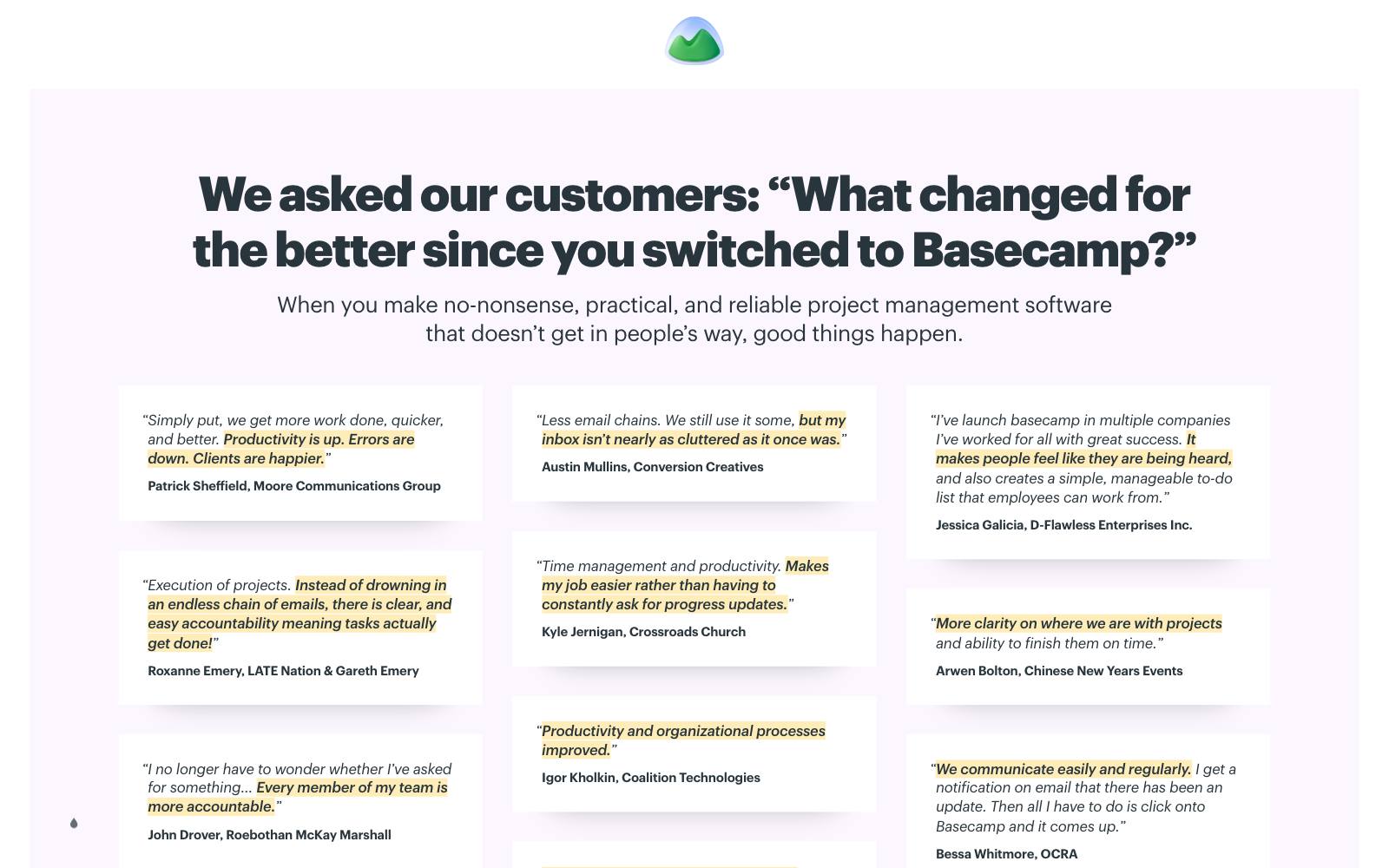
What they did: The Basecamp customers page opens with "We asked our customers: 'What changed for the better since you switched to Basecamp?'" and then lists a long scroll of text quotes, each with a name and company.
Some quotes include a number, such as "we have eliminated 95% of our paper usage."
Why it works: Asking every customer the same question gives focused, comparable answers. The sheer volume does the persuading.
Result: Live example, not tested. The numbers are customer claims, not test results.
Copy this: Send customers one question about what changed after they started using you, and publish the answers with names.
20. Notion: customer stories you can filter
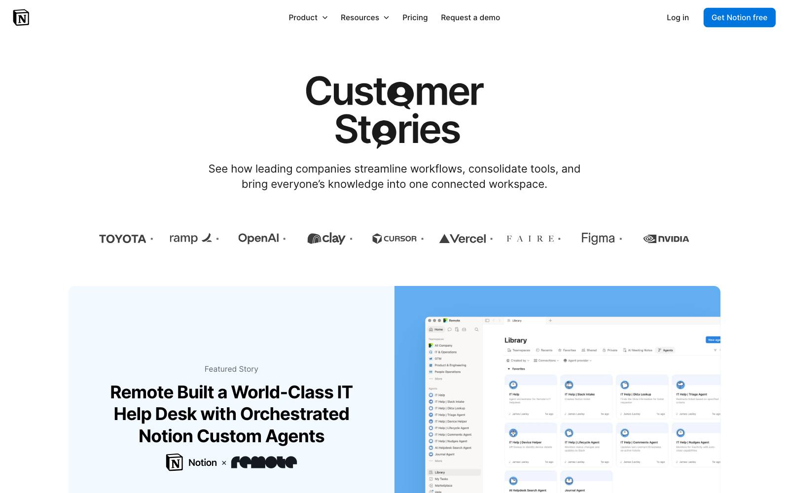
What they did: The Notion customers page pairs customer logos with one metric per story, such as "70% cut in productivity-tool costs" for Ramp.
Visitors can filter by team size and industry.
Why it works: Filters let each visitor find proof from a company like theirs, the same idea that worked in the Buildium test.
Result: Live example, not tested.
Copy this: If you have more than a dozen case studies, tag them by industry and size and let visitors filter.
Patterns across the winners
Placement beats quantity
Most of the big wins came from moving testimonials, not writing new ones.
KlientBoost, IMD and WikiJob all got better results once testimonials moved up or next to the form, and WikiJob's earlier test with them lower down had no effect.
Hotel Institute Montreux and Supergut put them directly beside the action.
Specific beats general
Buildium's unit counts, Supergut's product-specific quotes and Basecamp's numbers all make proof feel relevant.
"Great service!" tells a visitor nothing they can use.
Format matches the decision
Video worked for expensive or physical decisions (an MBA, a product you want to see in use).
Short text worked on sign-up and lead pages.
Photos helped reviews feel real. For lead forms, one quote was enough.
One to three, not a wall
Blend Commerce's single featured review, Dave Diederen's single written review and WikiJob's three short quotes all won.
Readers skim, so fewer, better quotes get read.
Examples that lost (what not to copy)
Testimonials do not always help. These results are just as useful.
- Testimonials crammed into the buy box. Clean Commit moved a block of three testimonials next to the title, price and add to cart on a Shopify product page. Conversion rate fell: -9.2% conversion rate. The result was not significant, but it fell on both devices.
- Written reviews above the fold, removed. Dave Diederen tested taking written reviews out of the top of the product page, leaving stars near the title. Removing them won: +23.05% revenue per visitor. Compare that with entry 11, where adding one review there also won. Your page decides, so test it.
- A redesign built around testimonials. Clean Commit's product page redesign with short testimonials above the fold and a how-it-works section lost: -10.0% revenue per visitor. Several changes shipped together.
- Quotes from well-known figures before a donation ask. Dallas Theological Seminary added its value proposition and quotes from well-known figures before asking for a gift, tested by NextAfter. Donations fell: -28% donations. Visitors were already motivated, and the extra content got in the way.
- Parent testimonials with photos. Clean Commit's kid photos and parent testimonials looked promising but stayed flat: +15% RPV, not significant.
The pattern: testimonials help when they answer a doubt the visitor has.
They hurt when they crowd the buying area or slow down people who were ready to act.
How to test this on your own site
- Find the doubt. Read your reviews, support tickets and exit surveys for the main reason people hesitate.
- Pick quotes that answer it. Choose one to three short testimonials that address that doubt, with a name and a qualifier (role, company size, product used).
- Test placement first. Move existing testimonials next to your form, sign-up button or add to cart before writing new ones.
- Measure the right metric. Track sign-ups, leads or revenue per visitor, not clicks. See our guide on A/B testing metrics.
- Run it long enough. Several tests here had small samples. Read how long to run an A/B test before you call a winner.
For more ideas, see our social proof examples, review tests and sign-up page examples.
Real results
 Mida
 Visually
 Apexure
 Clean Commit
Watch out for
- Fake or edited testimonials. Visitors spot generic praise, and invented quotes can break consumer protection rules. Use real quotes from real customers, with permission.
- Cherry-picked results as typical. If a quote cites a big number, make clear it is one customer's experience.
- Page speed. Video and review widgets add weight. Lazy-load anything below the first screen.
- Clutter near the button. As the Clean Commit test shows, more proof in the buy box can push the key information out of view.