




The sign up page examples that converted best in our archive did one of three things: they removed a step, field or worry (Britannica cut one registration page and got 117% more free trials), they added proof beside the form (Teamleader's customer logos took sign-ups from 36% to 40.3%), or they changed the offer itself (Acuity's card-up-front trial lifted paid sign-ups 268%).
The live pages worth copying, like Calendly and Notion, pair one email field with one-click SSO.
How we picked: 16 of these 20 are A/B tests or measured results from the LiftArchive database, with the number and who ran it.
The other four are public sign-up pages we loaded in November 2026. We have not run these tests ourselves.
A good example here means the page asked for less, explained more, or showed proof at the moment of sign-up, and someone measured it.
For the full flow after the form, see our guides to the SaaS sign-up flow and free trial conversion.
All 20 examples at a glance
| # | Example (brand or page) | What they did | Result | Type |
|---|---|---|---|---|
| 1 | Britannica | Cut one page from registration | +117% free trials | SaaS |
| 2 | Teamleader | 'No credit card required' note | +12.5% sign-ups | SaaS |
| 3 | Acuity Scheduling | Card-up-front Pro trial vs free plan | +268% paid sign-ups | SaaS |
| 4 | Calendly | Email plus Google/Microsoft SSO | Live example | SaaS |
| 5 | DoctorBase | Fewer sign-up fields | +30% sign-ups | SaaS |
| 6 | Vandebron | Plain date-of-birth field | +16.3% sign-ups | Lead gen |
| 7 | PureGym | Search box instead of dropdown | +3.4% conversion | Lead gen |
| 8 | Teamleader | Icons next to fields | +13.1% free trial sign-ups | SaaS |
| 9 | Teamleader | Customer logos | 36% to 40.3% | SaaS |
| 10 | Mida | Testimonials on sign-up page | +56.94% completion | SaaS |
| 11 | Planoly | Login button removed, proof added | +17% paid clients | SaaS |
| 12 | EZ Texting | Live chat beside form | +31% sign-ups | SaaS |
| 13 | Understand Quran Academy | Guarantee and app store icons | +32.57% paid sign-ups | SaaS |
| 14 | Subscription site | Email field in trial CTA | +133% sign-ups | SaaS |
| 15 | Booking.com | Sticky mobile CTA | +36% registration clicks | Lead gen |
| 16 | Notion | Work email plus three SSO options | Live example | SaaS |
| 17 | Airtable | Company SSO on first screen | Live example | SaaS |
| 18 | BliVakker.no | Facebook login removed | +3% conversions | Ecommerce |
| 19 | Online services company | Single column, one CTA | +265.6% clickthrough | SaaS |
| 20 | Shopify | One field, price shown | Live example | Ecommerce |
The 20 sign up page examples
1. Encyclopaedia Britannica: one page cut from registration
What they did: Britannica Online removed a whole page from its subscription registration path, so visitors reached the free trial form one step sooner.
Why it works: Every extra page is another place to leave.
Cutting a step that asked for nothing the trial needed removed a drop-off point without changing the offer.
Result: Free trials rose 117%, paid subscriptions 61% and revenue 130%. MarketingExperiments ran the test. See the test.
Copy this: Map every page between your CTA and the account being created, and cut any page that doesn't collect something you need on day one.
2. Teamleader: 'No credit card required' next to the form
What they did: Teamleader, a CRM for small businesses, added a 'No credit card required' line to its free trial sign-up page.
Why it works: People hesitate at a trial form because they expect a surprise charge.
One line removes that fear before they type anything.
Result: Sign-ups on the Dutch site went from 48.7% to 54.8% (+12.5%), and the Belgian site rose from 33% to 38.6%.
Teamleader ran the test itself. See the test.
Copy this: If your trial needs no card, say so right under the form's button, not in the FAQ.
3. Acuity Scheduling: a card-up-front Pro trial instead of a free plan
What they did: Acuity sent its main sign-up button to a 14-day trial of its $10/month Professional plan, which asked for card details, instead of a limited free-forever account.
Why it works: Asking for a card filters for people who mean to pay, and a full-feature trial shows them the paid product.
It changes the offer, not just the page.
Result: Paid Professional sign-ups rose 268%. Acuity Scheduling ran the test; total sign-ups including free accounts were not reported, so the effect on volume is unknown. See the test.
Copy this: Judge a card-up-front test on paid customers, not sign-ups.
Expect fewer accounts and decide if the paid gain is worth it.
4. Calendly: email first, Google and Microsoft one click away
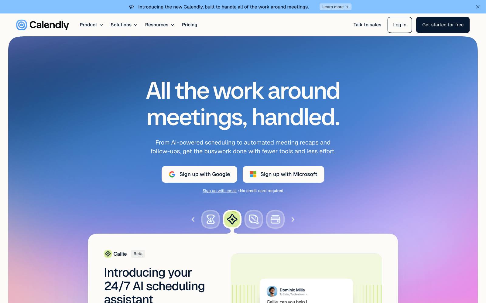
What they did: Calendly's sign-up page leads with "Create a free account" and "No credit card required.
Upgrade anytime." One email field sits above "Continue with Google" and "Continue with Microsoft" buttons, with a note that these connect your calendar.
Why it works: The SSO buttons are tied to a reason the product needs: Calendly has to read your calendar anyway.
That makes the one-click option feel useful rather than just quick.
Result: Live example, not tested.
Copy this: If you offer SSO, pick the providers your users already need to connect, and say in one line what they get by using them.
5. DoctorBase (Kareo Marketing): fewer fields on the sign-up form
What they did: DoctorBase removed fields it didn't need from its doctor sign-up form.
Why it works: Doctors are busy and every field looks like work.
Fields that only serve sales or reporting can be asked for later, once the account exists.
Result: New doctor sign-ups rose 30%. Kareo Marketing ran the test. See the test.
Copy this: List each field and who uses the answer.
If nobody uses it in the first week, drop it or move it into onboarding.
6. Vandebron: a plain date-of-birth field
What they did: Vandebron, a Dutch green energy supplier, swapped a clumsy calendar picker on the date-of-birth field for a plain text input that formats itself as you type.
Why it works: Calendar pickers are slow for dates decades back.
A field people can type into in a few seconds stops the form stalling on its last step.
Result: Sign-ups rose 16.3% and drop-offs on that field fell 80%. Vandebron ran the test. See the test.
Copy this: Check your form analytics for the one field with the most drop-offs and fix how it works before you cut anything else.
7. PureGym: a search box instead of a 450-gym dropdown
What they did: On the first step of its join flow, PureGym replaced a dropdown of more than 450 gyms with a search field that filters as you type.
Why it works: Scrolling a huge list is tedious on a phone.
Typing a town gets people to the right option fast.
Result: Membership sign-up conversion rose 3.4%. PureGym ran the test. See the test.
Copy this: Any dropdown with more than about 20 options (countries, locations, job titles) is a candidate for type-to-search.
8. Teamleader: icons next to each form field
What they did: Teamleader added a small icon beside each field on its free trial form.
Why it works: Icons help people scan what each field wants, and they make a form look lighter and easier to finish.
Result: Free trial sign-ups went from 32.84% to 37.11% (+13.1%). Teamleader ran the test. See the test.
Copy this: Try field icons on forms with four or more fields, where scanning matters most.
9. Teamleader: customer logos on the sign-up page
What they did: Teamleader added customer logos to its free trial sign-up page.
Why it works: At the moment of sign-up, people want to know others like them use it. Logos answer that without adding reading.
Result: Conversion on the Dutch site went from 36% to 40.3% (+12%). Teamleader ran the test. See the test.
Copy this: Put 4-6 recognizable customer logos near the form, chosen to match the visitor's market where you can.
10. Mida: testimonials on the sign-up page
 Mida
What they did: Mida, an A/B testing tool, added customer testimonial blocks to its sign-up page.
Why it works: Quotes from real users answer "will this work for me" at the exact point people decide.
Result: Sign-up completion went from 37% to almost 60%, reported as +56.94%.
Mida ran the test, and the sample was small, at about 200 sign-ups, so the true lift may be smaller. See the test.
Copy this: Add two or three short testimonials beside the form that name a specific outcome, then rerun the test if your sample is small.
11. Planoly: no login button on the sign-up page, plus proof
What they did: Planoly removed the login button from its sign-up page and added a testimonial and achievement badges.
Why it works: A login button on a sign-up page invites new visitors to click the wrong thing.
Proof gives them a reason to go on.
Result: Paid clients rose 17%. CodaLift LLC ran the test, and the changes shipped together, so no single change gets the credit. See the test.
Copy this: Make "Log in" a small text link, and use the space for proof.
12. EZ Texting: live chat beside the sign-up form
What they did: EZ Texting, an SMS marketing tool, added a live chat widget next to its sign-up form.
Why it works: Some visitors have one question left before they commit.
Chat lets them ask it instead of leaving.
Result: Sign-ups rose 31%. EZ Texting ran the test; there is no data on how many visitors used the chat. See the test.
Copy this: If your sales team gets the same pre-sign-up questions, try chat on the sign-up page during staffed hours.
13. Understand Quran Academy: guarantee and app store icons above the plans
What they did: This online course subscription added large icons for its money-back guarantee and the Apple App Store above its plan buttons.
Both facts were already on the page as plain text.
Why it works: Turning buried text into visible badges lowers the perceived risk of a paid sign-up and shows the product is a real app.
Result: Paid sign-ups rose 32.57% at 98% significance over 11 days.
Understand Quran Academy ran the test. See the test.
Copy this: Find the reassurance already on your page in small print, and turn it into a visual badge next to the button.
14. A subscription site: an email field in the trial CTA
What they did: A monthly subscription site under $30 a month added an email capture field to the call to action on its free trial offer page.
Why it works: Typing an email feels like a small first step, and once started, people tend to finish.
The team expected a small drop and got the opposite.
Result: Direct trial sign-ups went from 0.68% (222 of 32,782 visitors) to 1.57% (480 of 30,479), a 133% lift. MarketingExperiments ran the test. See the test.
Copy this: Test starting the sign-up with a single email field on the landing page, then carrying it into the full form.
15. Booking.com: a sticky CTA on the mobile join page
What they did: Booking.com's Partner Hub added a sticky call-to-action bar to its mobile 'Join now' page for property owners.
Why it works: Long mobile pages push the button out of view.
A bar that stays on screen means the next step is always one tap away.
Result: Clicks to start registration rose 36%. Booking.com ran the test.
The metric is clicks, not completed registrations. See the test.
Copy this: On long mobile sign-up pages, test a sticky bar, and track completed accounts, not only clicks.
16. Notion: work email first, three SSO options
What they did: Notion's sign-up page asks for a work email, with a tip that a work email makes it easier for your team to join.
Below it sit Google, Microsoft and ChatGPT sign-in options, and a small "Log in" link for existing users.
Why it works: Asking for a work email steers people toward team accounts, which matter for a product sold by seat.
The tip explains why instead of just demanding it.
Result: Live example, not tested.
Copy this: If you sell to teams, explain in one line why a work email helps the user, not you.
17. Airtable: single sign-on next to Google and Apple
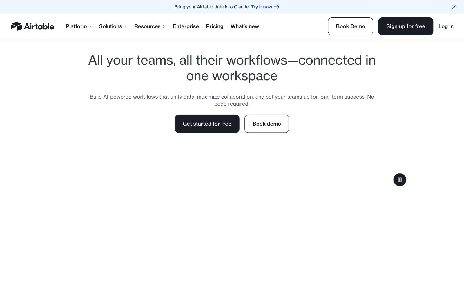
What they did: Airtable's sign-up page is one work email field and a Continue button, then "Continue with Single Sign On," Google, Apple and ChatGPT.
Why it works: Offering enterprise SSO on the first screen tells larger companies the product fits their IT rules, while the consumer providers keep it quick for everyone else.
Result: Live example, not tested.
Copy this: If you sell to larger companies, put a company SSO option on the sign-up screen, not only in account settings.
18. BliVakker.no: Facebook login removed
What they did: BliVakker.no, a Norwegian cosmetics retailer, removed the Facebook login option from its checkout login page.
Why it works: More buttons mean more choices.
If few people use one social login, it adds clutter and doubt without helping.
Result: Conversions rose 3% on about 8,000 visitors, with no significance stated, so treat it as tentative.
BliVakker.no ran the test. At minimum, removing the option did not hurt. See the test.
Copy this: Check how many sign-ups each social button brings.
Test removing any provider that brings very few.
19. An online services company: a single-column sign-up page with one CTA
What they did: A B2C online services company cut its registration page to a single column with only one call to action.
Why it works: Two columns and several buttons split attention.
One column and one action make the next step obvious.
Result: Clickthrough rose 265.6% and account sign-up conversion rose nearly 27%.
MarketingExperiments ran the test; the layout and CTA count changed together. See the test.
Copy this: Remove sidebars and secondary buttons from your sign-up page so the form is the only thing to do.
20. Shopify: one email field and a clear price
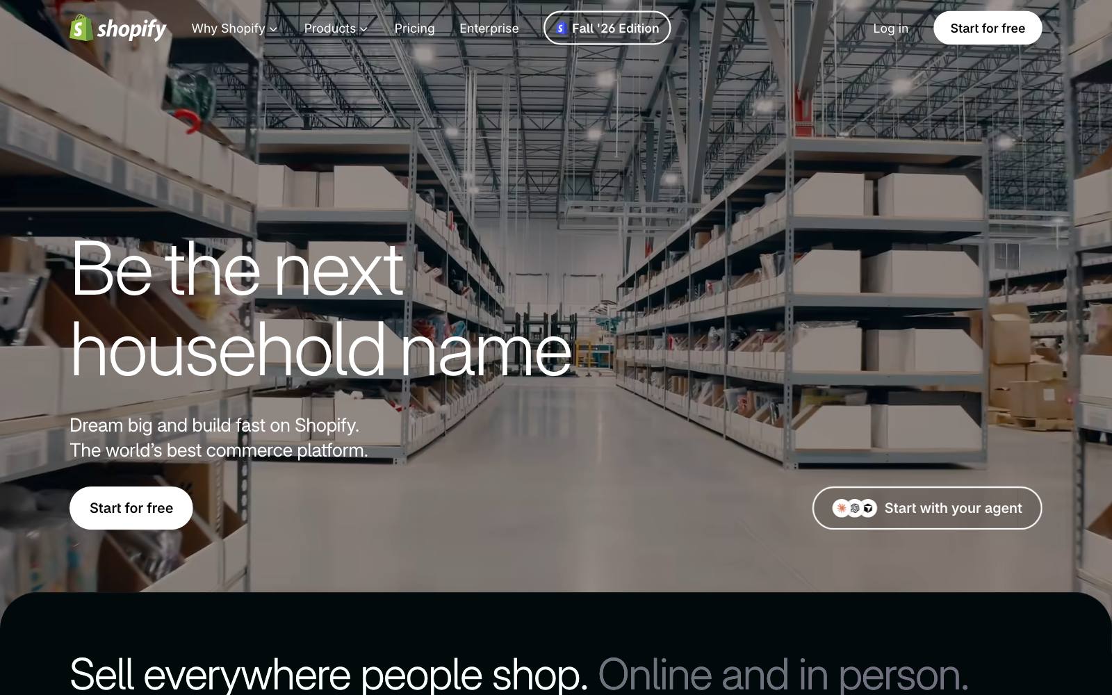
What they did: Shopify's free trial page leads with "Start for free, keep building for $1/month" and a single "Enter your email" field, followed by logos from brands like Gymshark and Brooklinen.
Why it works: The page answers the two big questions, what it costs and who uses it, and asks only for an email to start.
Result: Live example, not tested.
Copy this: State the price after the trial right next to the form, and ask for one field to get started.
Patterns across the winners
Card or no card: decide on paid customers, not sign-ups
Telling people no card is needed lifted Teamleader's sign-ups, while asking for a card at Acuity lifted paid sign-ups.
Both can be right. A no-card trial wins on volume; a card-up-front trial can win on paying customers.
Linearity Curve saw a similar trade-off when it made its trial opt-in: trial conversion rose 10% while trial starts fell (see the test). Read more in freemium vs free trial.
Fix the hard field before you cut fields
Vandebron and PureGym won by making one field easier, not by removing it.
DoctorBase won by removing fields. GrowthRock removed two fields and saw nothing (below).
The common thread is effort: find where people stall. Our form fields page collects more tests.
Proof belongs next to the button
Logos (Teamleader), testimonials (Mida, Planoly), guarantee badges (Understand Quran Academy) and live chat (EZ Texting) all won by answering doubt at the moment of sign-up. See more on social proof.
SSO: offer the providers your users need
Calendly, Notion and Airtable each show social sign-in, but they pick providers that match their product: calendars, work accounts, company SSO.
BliVakker's test suggests a provider few people use can be dropped without harm.
We don't have a clean A/B test of adding Google sign-in yet, so test it before assuming it helps.
Examples that lost (what not to copy)
Madlibs form: Patrick McKenzie put the fields inside a sentence on Bingo Card Creator.
Trial sign-ups fell from 27.55% to 21.73%, about 22% worse, at 95% confidence (see the test). Clever layouts can slow people down.
Shorter form, fewer payers: A paid-content site's shorter sign-up step raised free sign-ups from 49.29% to 57.39%, but paid memberships fell from 0.97% to 0.72% (see the test).
MarketingExperiments ran it. More sign-ups are not the goal if they don't pay.
An extra step up front: RegOnline moved its free trial sign-up from two steps to three, asking contact details first, and completed leads fell 24.5% (see the test).
Copy changed too, so the step isn't the only cause.
Compare our multi-step form tests before splitting your form.
Fewer fields, no change: GrowthRock removed two sign-up fields for a SaaS client and saw no lift; the shorter form trended slightly worse (see the test).
Cutting fields only helps when those fields were the problem.
Removing checkboxes: Patrick McKenzie removed two mailing-list checkboxes and trial sign-ups stayed flat (see the test).
How to test this on your own site
- Measure each step. Track visits to the sign-up page, form starts, each field's drop-off and completed accounts, so you know where people leave.
- Pick a metric past the form. Use activated accounts or paid customers as the main goal, as Acuity and Planoly did, since a sign-up lift can hide a paid drop.
- Start with the cheapest fixes. A "no credit card required" line, a login link made smaller, or a fixed field can ship in a day.
- Test the offer separately. Card vs no card and trial length change who signs up, so run them as their own tests with enough time to see paid conversions.
- Wait for enough data. Mida's result rests on about 200 sign-ups. Small samples overstate lifts, so plan your sample size first.
More ideas: SaaS sign-up page tests, lead gen sign-up pages, the best form tests and onboarding examples for what happens next.
Real results
 MarketingExperimentsMarketingExperiments
Watch out for
- Sign-ups that never pay. Making sign-up easier can bring in people who never activate, as the paid-content test showed.
- Hidden charges. If you ask for a card, say when the first charge happens and how to cancel. Surprise charges drive refunds and chargebacks.
- Too many SSO buttons. Four or five providers can crowd out the email field. Keep the ones your users actually pick.
- Bundled changes. Planoly and the single-column registration page shipped several changes at once, so you can't know which one did the work.