





LiftArchive is a database of other people's A/B tests.
So it felt a little silly that our own homepage had never been checked against it.
On November 1 we fixed that.
We pulled every homepage and hero test in the database, rebuilt the hero from what won, and shipped it the same night.
This is what the tests said, what we changed, and the one thing the tests could not tell us.
The before
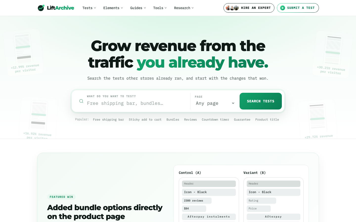
The old hero had a big headline, "Grow revenue from the traffic you already have," and a two-part search box.
Four winning test cards floated behind it, faded almost to nothing.
It looked fine.
But it had three problems we only saw once we compared it with the data.
It never said what LiftArchive is.
The results, which are the whole product, were decoration.
And every suggested search was for an online store, even though about 30% of our measured tests now come from SaaS, lead-gen and mobile apps.
What we searched
We filtered the database to measured tests on homepages, landing pages, sign-up pages and lead forms, run on the hero, headline, call to action, social proof or category navigation.
That gave us 212 results: 196 wins, 9 losses and 7 flat tests.
Most of these are single tests reported by the people who ran them, so we read them as evidence, not as rules.
Four patterns showed up again and again.
1. Show the best things above the fold
A best-sellers row right under a homepage hero lifted revenue per visitor by 29.72% in a test by Dave Diederen (test).
Moving best sellers above the fold lifted it by 39.03% in another of Dave's tests (test).
A smaller hero with best sellers higher up lifted conversion 26% for Dr. Axe, in a test by Conversion Fanatics (test).
Our best sellers are test results.
So we put four real ones under the hero, one each for ecommerce, SaaS, lead-gen and apps, and dropped the faded floating cards.
2. Say what the thing is
A hero headline that named the product earned about $19,441 more per month in a test by Convertibles.
Our old headline promised an outcome but never said "this is a searchable database of test results."
The new one says it in the first five words: "Search 1,724 real A/B test results. Start with what already won."
3. Say it's free
Adding "It's free!" next to a sign-up button raised click-through 28% for Soocial (test).
The old hero never mentioned that LiftArchive costs nothing.
The new line under the headline reads: "Free, and credited to the practitioners who ran them."
4. Let people pick their category
Adding a category filter to a homepage lifted revenue per visitor 7.09% (test).
Putting the most-clicked category first lifted it 14.40% (test).
Both were Dave Diederen's tests.
We replaced the "Page" dropdown with tabs for All tests, Ecommerce, SaaS, Lead gen and Apps.
The suggested searches change with the tab, so a SaaS visitor sees "Pricing" and "Demo," not "Sticky add to cart."
What we didn't do
The losses were just as useful.
Replacing a trust-focused hero with a sales carousel cut conversions 46.2% in a test by Clean Commit (test).
Replacing a hero video with a static image and a benefit callout lifted revenue per visitor 52.67% in a test by Dave Diederen (test).
So: no carousel, no video, nothing that moves.
We also left one question open.
A second hero button won in some tests, like a +38.1% conversion lift for a supplement brand in a test by Blend Commerce (test).
A single button won in others, like +47% clicks to pricing for Artsy Editor (test).
When the evidence splits like that, it's a test to run, not a change to make.
So the hero keeps one button, and "Hire an expert" stays in the nav.
Version 1 was too busy
Our first mockup followed all of that literally.
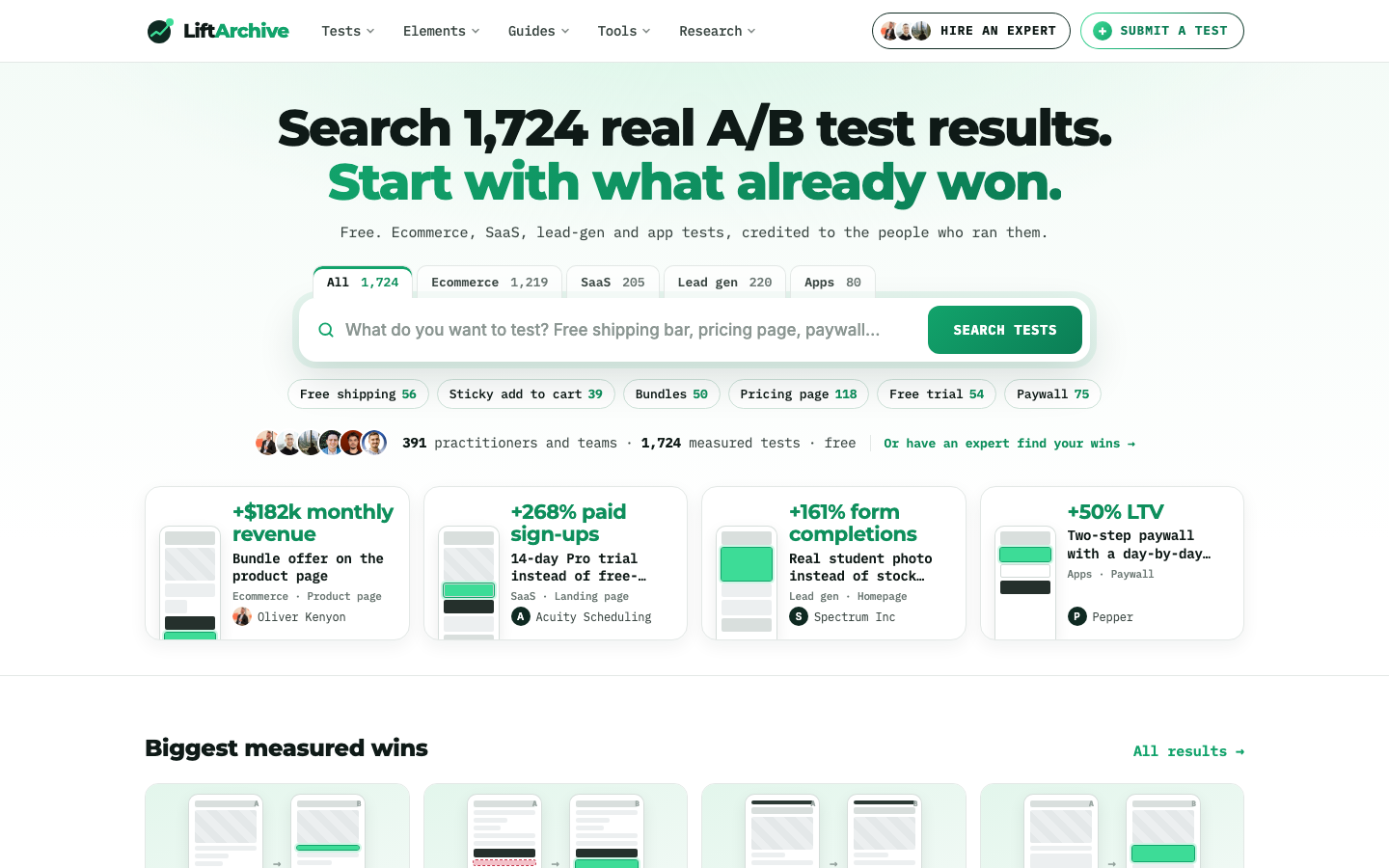
It had counts on every tab, counts on every suggested search, a proof line with three more numbers, an extra link, and a little phone drawing on every result card.
I looked at it and couldn't tell where I was supposed to look.
Every item on that page was backed by a test.
Together they buried the search box, which is the one thing the hero is for.
That's the part the database can't tell you.
Tests tell you what is worth including.
They don't tell you what to leave out.
The after
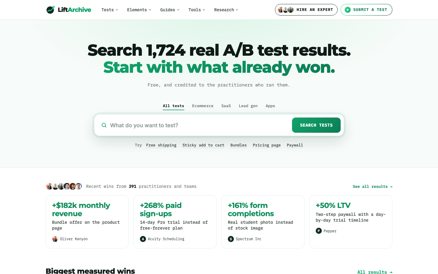
For version 2 we kept every idea and cut every repeat.
The headline already says 1,724, so the counts came off the tabs and searches.
The tabs became plain text with an underline.
The suggestions became a quiet "Try" line.
The practitioner faces moved down to sit with the result cards they describe.
The cards lost their drawings and kept three things: the result, the change, and who ran it.
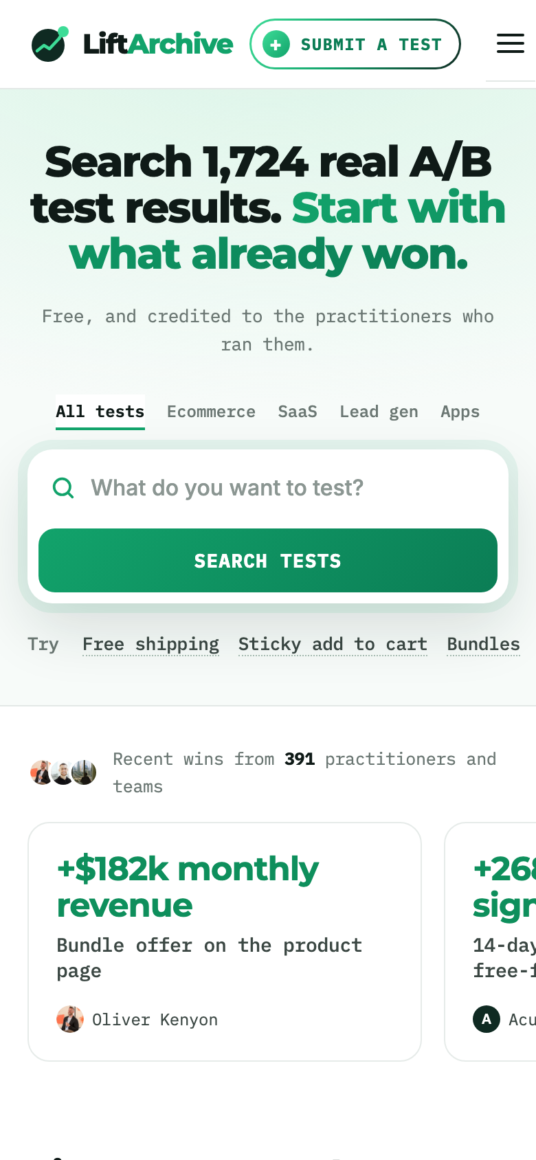
On a phone, the first result card now shows on the first screen.
Before, the whole first screen was a headline and a search box.
Did it work?
We don't know yet, and we won't pretend to.
LiftArchive is new, and a new site doesn't get enough traffic for a fair A/B test.
So this was a redesign based on evidence, not a measured win.
We're watching searches and clicks through to practitioners in our analytics, and we'll add the numbers here once there's enough data to mean something.
Try it on your own site
You can ask the same kind of question from ChatGPT or Claude.
LiftArchive has an MCP server at https://liftarchive.com/mcp/, and the setup guide takes about a minute.
As an example, we asked it for winning, quantified homepage hero tests:
search_tests(query: "homepage hero", outcome: "won", quantified_only: true)It found 58 matches. The top results were:
- Homepage hero with rating, benefits and press logos: +$78,454/month, by Oliver Kenyon
- Homepage hero with a USP bar and benefit bullets: +$77,558/month, by Oliver Kenyon
- Redesigned homepage hero: +72.15% revenue per visitor, by Dave Diederen
- Hero image matched to buyer intent: +7.50% revenue per visitor, by Dave Diederen
You can also give it your URL with suggest_tests_for_site and get test ideas for your own page, each one tied to a real result.
Or search the database the old-fashioned way.
Then take one more pass and remove whatever you don't need.